

A: Affordances - Making UI Actions Obvious
The art of crafting objects that whisper their purpose...
Affordances are the signals that make or break your UX
An affordance is a design element’s built-in suggestion about how it should be used. A design element, object, or interface should signal what actions you can take with it.
Ever tried to tap something in a mobile experience that seemed “tappable,” and nothing happened? Or tried to find a link on a page, but there was nowhere obvious to click?
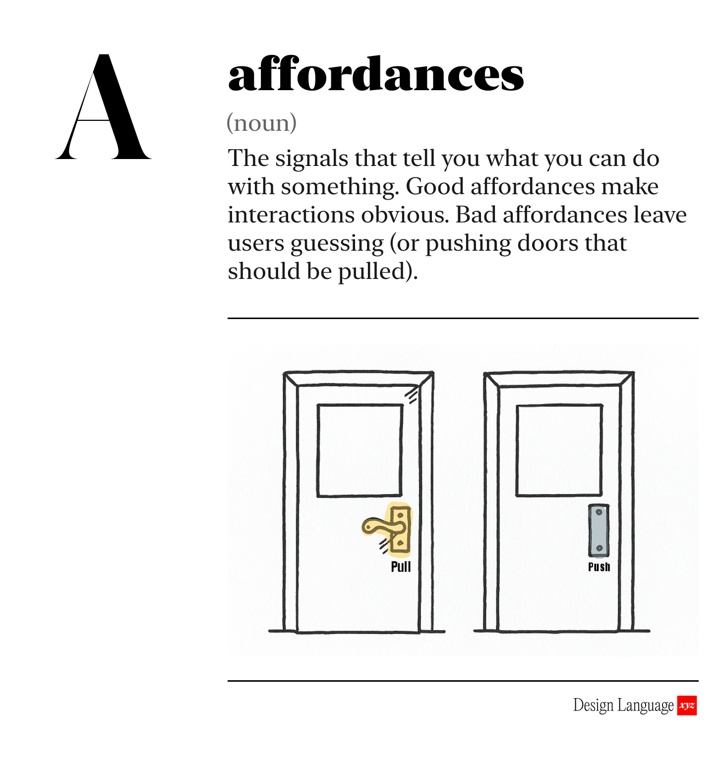
Ever tried to push a door that was pull only (side note, fuck these doors).

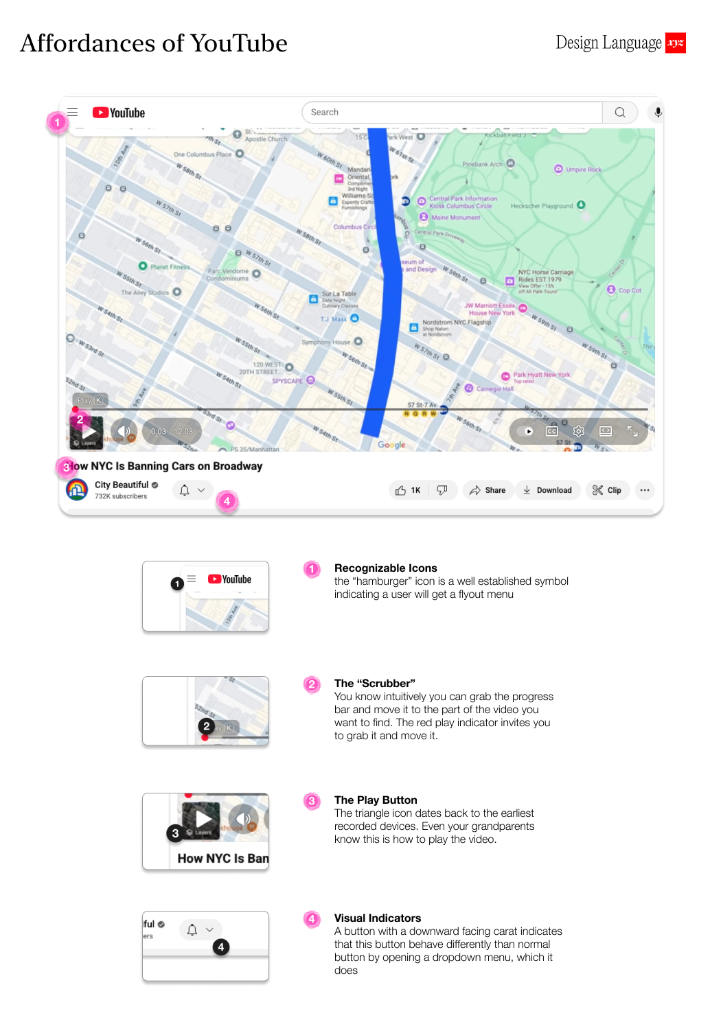
Affordances are the visual cues that suggest use.
A clearly designed button invites a tap; underlined text suggests a link. When these cues are clear, people act instinctively without thinking about it.
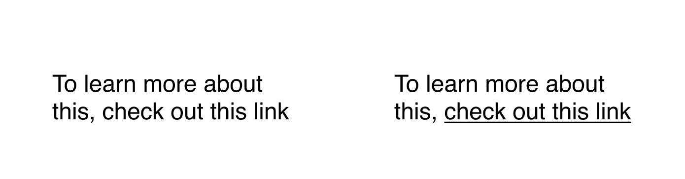
That underline on the link? That’s the affordance. It instantly communicates “this will take you somewhere else.” It’s one of the internet’s earliest design patterns, and is now so ingrained that you don’t even think about it.
And it’s jarring and weird when underlined text is NOT a link. It messes with your expectations and learned behavior. It feels broken.
Affordances can be shapes, text, color, etc., and there is no right or wrong approach - as long as the outcome is clarity. Decades of digital design has taught us all to understand common design patterns as affordances, like the link example above. Take advantage of all that work.

Why should I care?
Affordances can be the difference between a product that feels intuitive vs. one that feels broken. Users will quietly bounce or churn if poorly designed affordances make the product feel hard to use, and never return.

How to use this today
When reviewing a new design or existing product, ask:
Is it clearly understood what actions can be taken?
Are there any interactive elements that are hard to recognize?
Are any expectations subverted or broken about how something should work?

Designing with AI: Test Your Product’s Affordances with LLMs
Take a screenshot of your UI and drop it into ChatGPT/Claude with this prompt:
"You are the world’s foremost UX design expert. Please analyze this design for use of affordances. Identify all interactive elements on the page and present them in a list. Then flag any interactive elements that don’t look interactive enough, or any non-interactive items that appear clickable (false affordances). Highlight any cases where a user’s expectations might be subverted. For each issue, explain why it could confuse users and suggest how to improve the design so it’s clear what can be clicked or tapped. Ask me any questions, one by one, about the intentions of on-screen design elements if they are unclear."

Dive in Deeper

About Us
Design Language is a newsletter for all product builders (PMs, Engineers, Founders, etc) who want to improve their design literacy, hone their sense of tase, and improve their craft when building products.
Jeremy Belcher is a 15 year product and design veteran. He has designed UX/UI for products used by tens of millions for brands like Google, Salesforce, Saturday Night Live, DirecTV, BMW, Emirates, Visa and in the past several years has focused on new enterprise workflow products. He runs the product studio Robot Heart, which designs, builds, and validates 0 → 1 B2B workflow tools for teams and founders.
David Issa is a digital strategy and product design leader with over 15 years of experience guiding companies through transformation. He has helped scale products and teams across healthcare, fintech, and enterprise software, translating complex systems into human-centered experiences. David runs a strategic design practice focused on aligning purpose, architecture, and execution—bridging design, AI, and organizational strategy to help teams build with clarity and intent.