

B : Buttons - Button Types and when to use them
Buttons should lead your users through the experience to your desired outcome.
Use the right button for the right action
Different button styles have different purposes, and using them incorrectly will confuse users and decrease engagement.
There are 4 basic button types a system should have, which have specific purposes.
Primary
Secondary
Confirmation
Danger

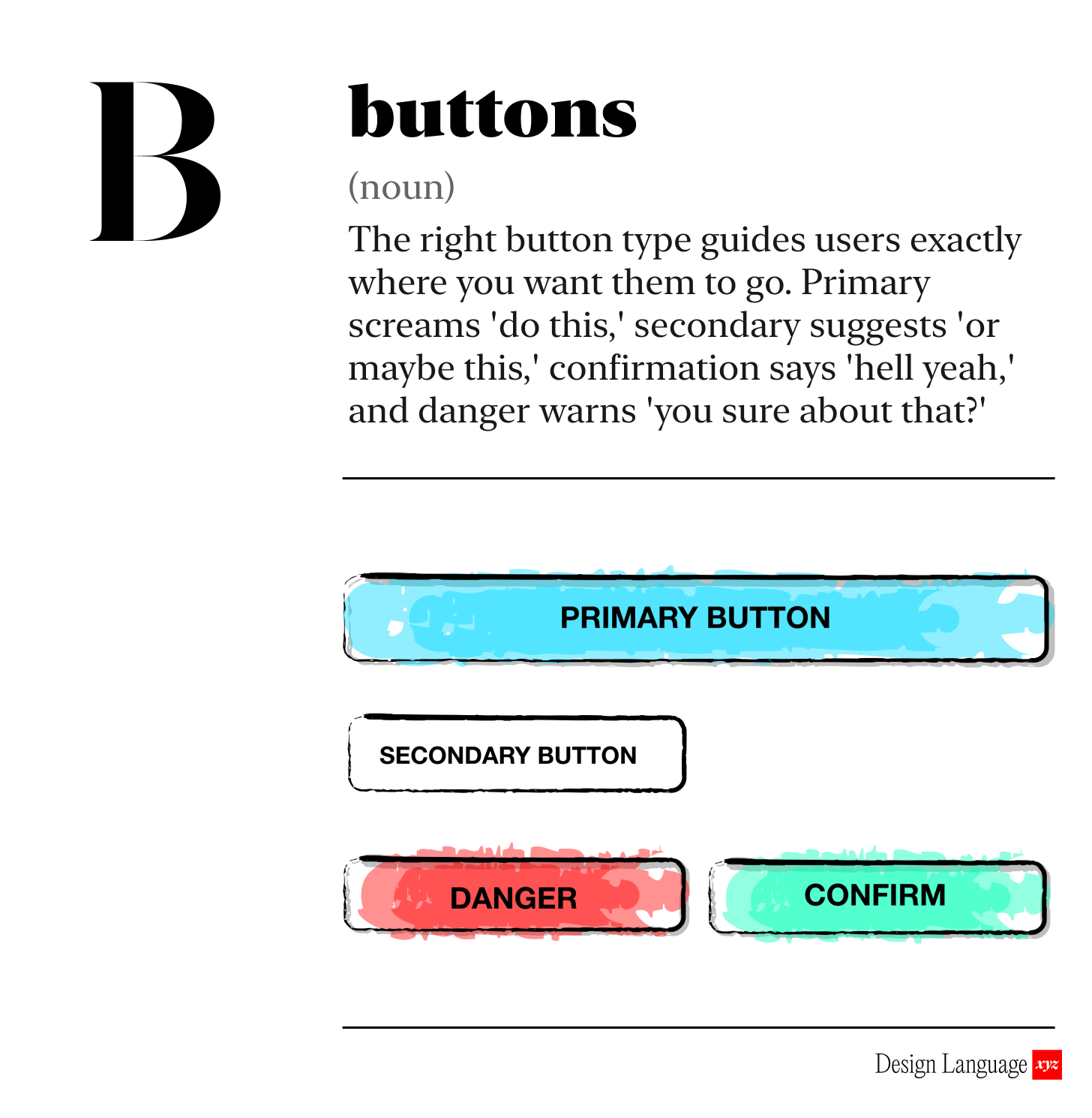
Button Types
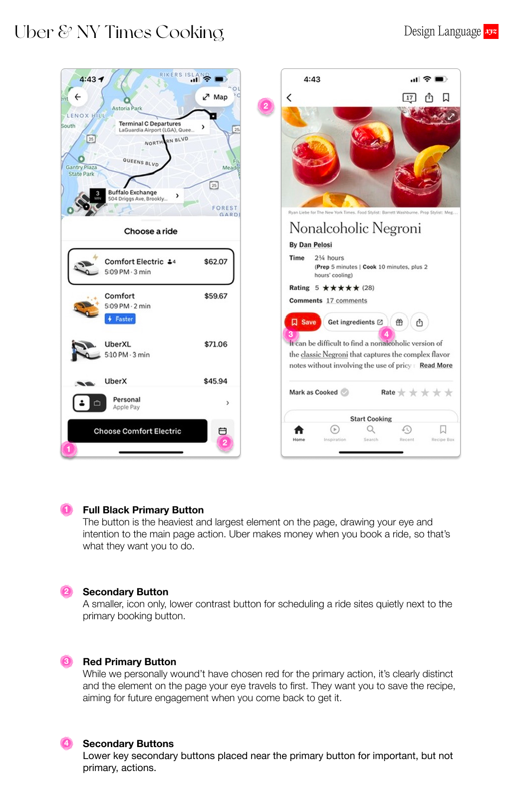
Primary
The primary is exactly what is sounds like - the most important action on a screen. There should be only one primary button on any given screen. Your primary button design should stand out as one of the most attention seeking elements on the page.
Secondary
Use these for all other actions that require a button. They should have a more conservative design and not stand out as dramatically as the primary buttons. You often see them with white backgrounds and dark text.
Confirmation
This button tells the user they are about to accomplish or confirm something. It’s usually a change to the system in a positive direction. This button is often Green. Good for actions like Save, Buy, Add, etc.
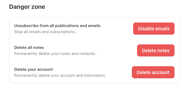
Danger
This tells the user they are about to take an action that takes something away, like deleting content or removing records. This button should be Red - and feel like an alert. Good for actions like delete, trash, remove, etc.
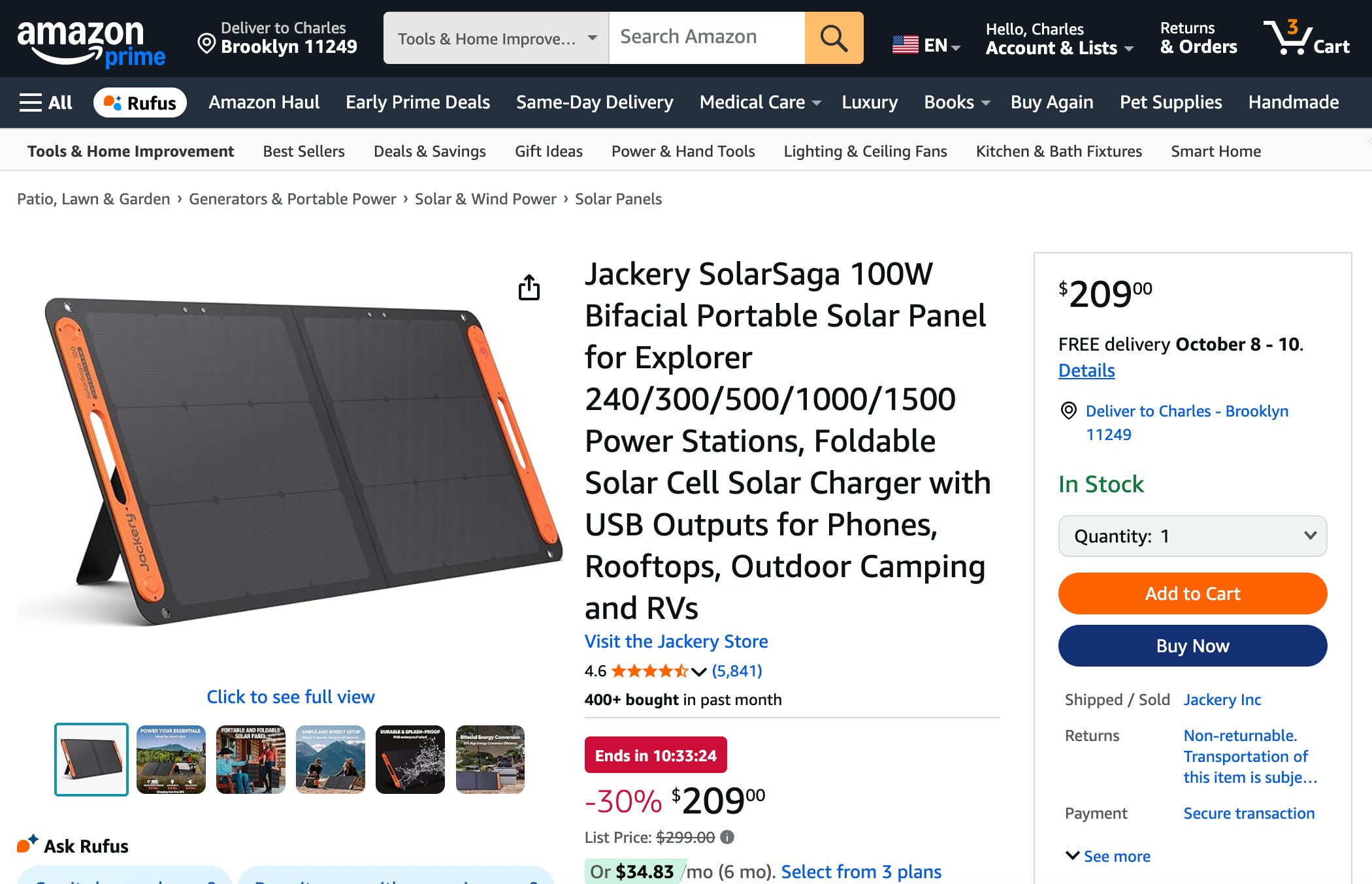
Even on Amazon, with it’s characteristically cluttered interface, the most important action is Buy Now, and your eye is drawn immediately to the button.

Why Should I care?
Buttons should lead your users through the experience to your desired outcome. If users take the wrong actions, don’t know what they should be doing, or where they should be going, this will lead to a bounce, churn, or cancellation.

How to Use Today
Pick one primary screen or workflow in your product and ask these 3 questions:
Is the primary button on the page used for the primary action?
Does the styling of this button make it stand out?
Do I only use this style to highlight the most important action, and not anywhere else?

LLM Prompt for Evaluation
Paste a screenshot of your screen or Figma frame into an image-capable LLM and ask:
“You are the world’s foremost expert in usability and UX design. Identify the primary action on this screen. Is it visually distinct, clearly labeled with a verb phrase, and positioned near the content it affects? Suggest improvements if not. If you are unsure, ask me questions, one by one, until you have the information you need to most accurately answer this question.”

Deeper Dives

About Us
Design Language is a newsletter for all product builders (PMs, Engineers, Founders, etc) who want to improve their design literacy, hone their sense of tase, and improve their craft when building products.
Jeremy Belcher is a 15 year product and design veteran. He has designed UX/UI for products used by tens of millions for brands like Google, Salesforce, Saturday Night Live, DirecTV, BMW, Emirates, Visa and in the past several years has focused on new enterprise workflow products. He runs the product studio Robot Heart, which designs, builds, and validates 0 → 1 B2B workflow tools for teams and founders.
David Issa is a digital strategy and product design leader with over 15 years of experience guiding companies through transformation. He has helped scale products and teams across healthcare, fintech, and enterprise software, translating complex systems into human-centered experiences. David runs a strategic design practice focused on aligning purpose, architecture, and execution—bridging design, AI, and organizational strategy to help teams build with clarity and intent.