

C: Common Region - Grouping Related Elements Clearly
Grouping is one of design’s simplest, strongest tools
The Principle of Common Region
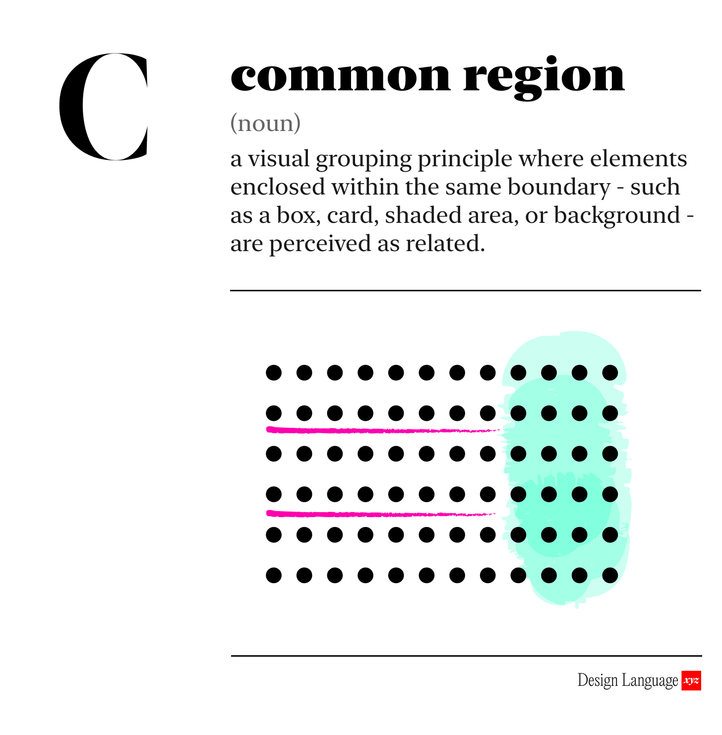
The principle of Common Region says that elements inside a defined boundary are perceived as belonging together.
By defining clear regions, users quickly understand structure, relationships, and context within an interface, reducing cognitive load and improving scan-ability.
In other words, people will think the stuff in the box is all related.
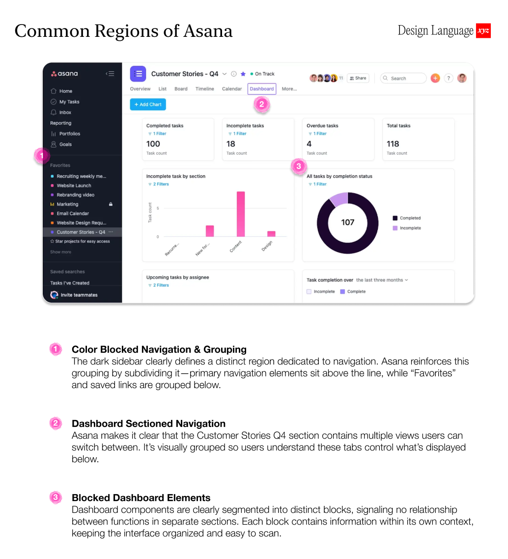
Ever noticed how a card UI makes separate bits of content feel connected? A photo, a title, and a button framed inside one box read as a single unified object.
Proximity, similarity, and region all guide how we make sense of visual information. Our brains assume: “If it’s inside the same box, it probably belongs together.”

Grouping supports cognition.
When related elements are not visually grouped, users must interpret relationships and expend mental effort to determine what belongs together. When elements are clearly grouped, the interface communicates structure for them. Effective use of common regions reduces cognitive burden, which is especially critical in high-density interfaces, making information easier to scan, digest, and act on.

Clear boundaries and consistent use of grouping make your product feel ordered, intentional, and easy to parse at a glance.

Why should I care?
Applying the common region principle makes complex interfaces easier to parse and reduces cognitive load. By making relationships visually explicit, users grasp structure instantly, move through tasks with less effort, make fewer mistakes, and operate with greater confidence and speed.

How to use this today
When reviewing your product or screen, ask:
Are related elements visually grouped in a shared region?
Are unrelated elements ever grouped by mistake?
Does every “card,” “panel,” or “section” have a clear reason to exist, or are some arbitrary boxes just adding noise?

Designing with AI: Test Your Product’s Grouping with LLMs
Take a screenshot of your interface and drop it into ChatGPT or Claude with this prompt:
“You are the world’s foremost UX design expert. Please analyze this design for use of the “Common Region” principle. Identify all distinct visual regions or groups. For each region, explain what the grouping communicates to users and whether it accurately reflects related functionality or content. Flag any regions where unrelated elements are enclosed together or related elements are visually separated. Recommend layout or boundary adjustments to make the grouping clearer and more aligned with user understanding. If you are unclear about anything, ask me questions, one by one, until you have the information you need.”

Dive in Deeper
Gestalt Principles of Perception | Interaction Design Foundation
Universal Principles of Design by Lidwell, Holden, & Butler

About Us
Design Language is a newsletter for all product builders (PMs, Engineers, Founders, etc) who want to improve their design literacy, hone their sense of tase, and improve their craft when building products.
Jeremy Belcher is a 15 year product and design veteran. He has designed UX/UI for products used by tens of millions for brands like Google, Salesforce, Saturday Night Live, DirecTV, BMW, Emirates, Visa and in the past several years has focused on new enterprise workflow products. He runs the product studio Robot Heart, which designs, builds, and validates 0 → 1 B2B workflow tools for teams and founders.
David Issa is a digital strategy and product design leader with over 15 years of experience guiding companies through transformation. He has helped scale products and teams across healthcare, fintech, and enterprise software, translating complex systems into human-centered experiences. David runs a strategic design practice focused on aligning purpose, architecture, and execution—bridging design, AI, and organizational strategy to help teams build with clarity and intent.