

D: Doherty Threshold — Designing for Instant Response
Designing for Instantaneous Interaction
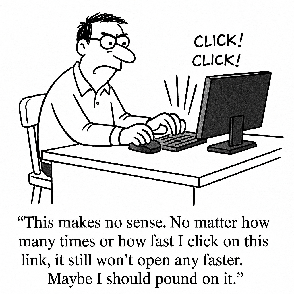
Slow experiences feel shitty and broken. There’s a science to why.
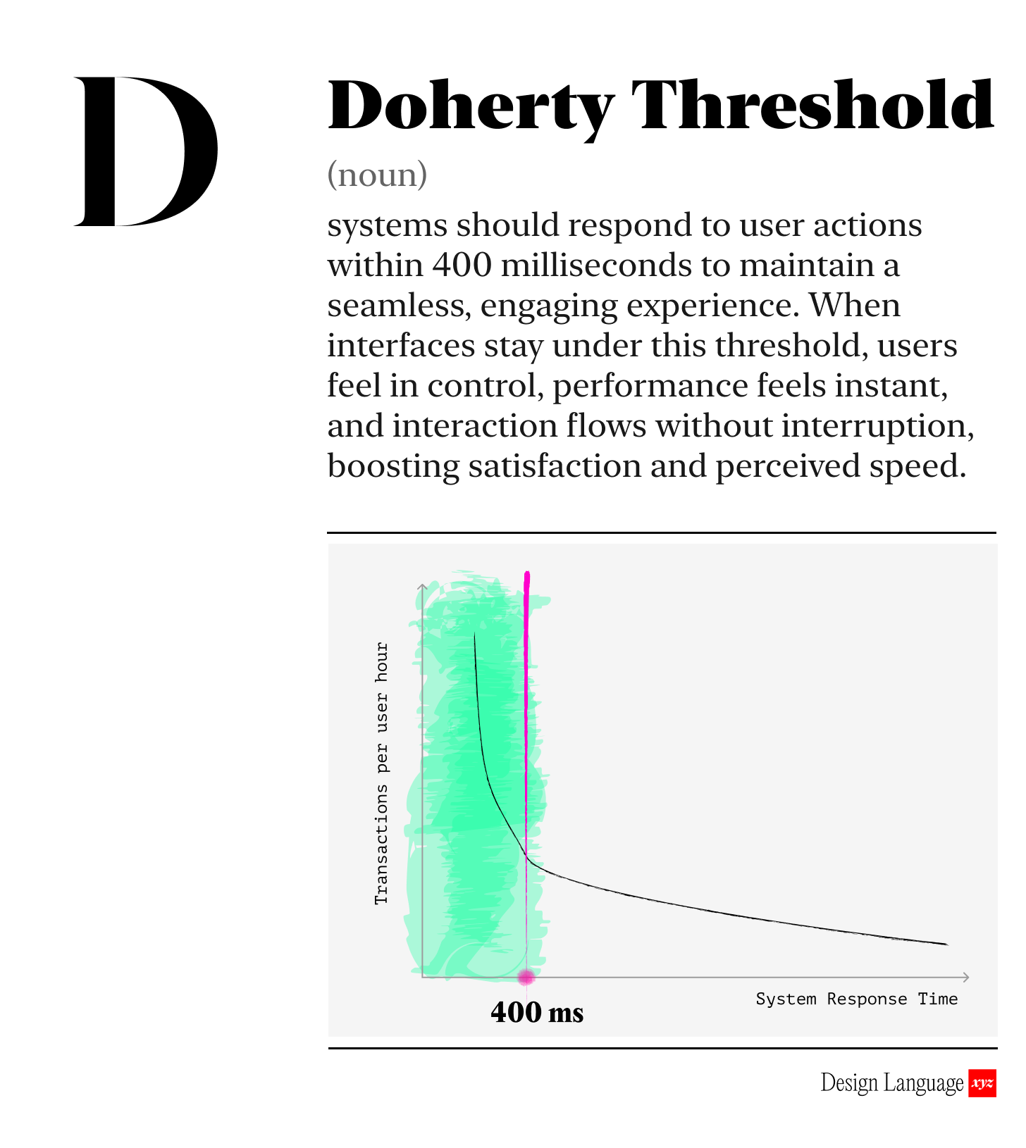
The “Doherty Threshold” says that when systems respond in under 400 ms (4/10ths of a second), users stay in a flow state and feel in control. The system feels fast and responsive. Anything slower breaks momentum and feels broken.
Now obviously not all actions can happen that quickly. We’re talking 4/10ths of a second! So when users tap a button, open a menu, or trigger a workflow, the system should acknowledge the action within the threshold, even if the full process continues in the background. That quick “I heard you” signal preserves rhythm and reduces frustration.
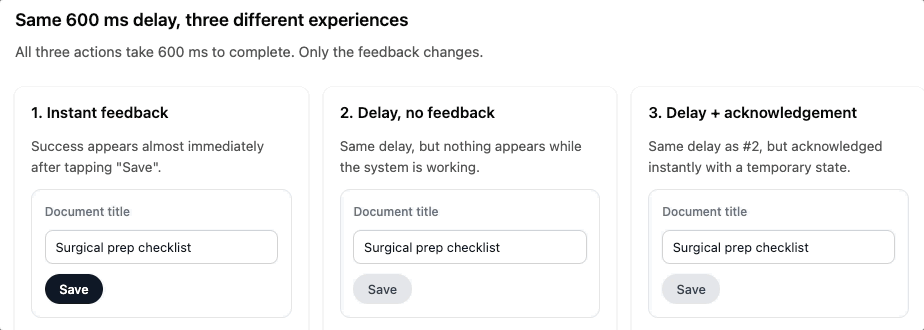
Take a look at the difference:
Try this for yourself in the Design Language Companion Guide →
Even small delays feels big
When feedback lands within 400 ms (4/10th of a second), users don’t consciously register the pause. They stay focused on the task, not the system. When feedback lags beyond that point, they start wondering if something is broken.
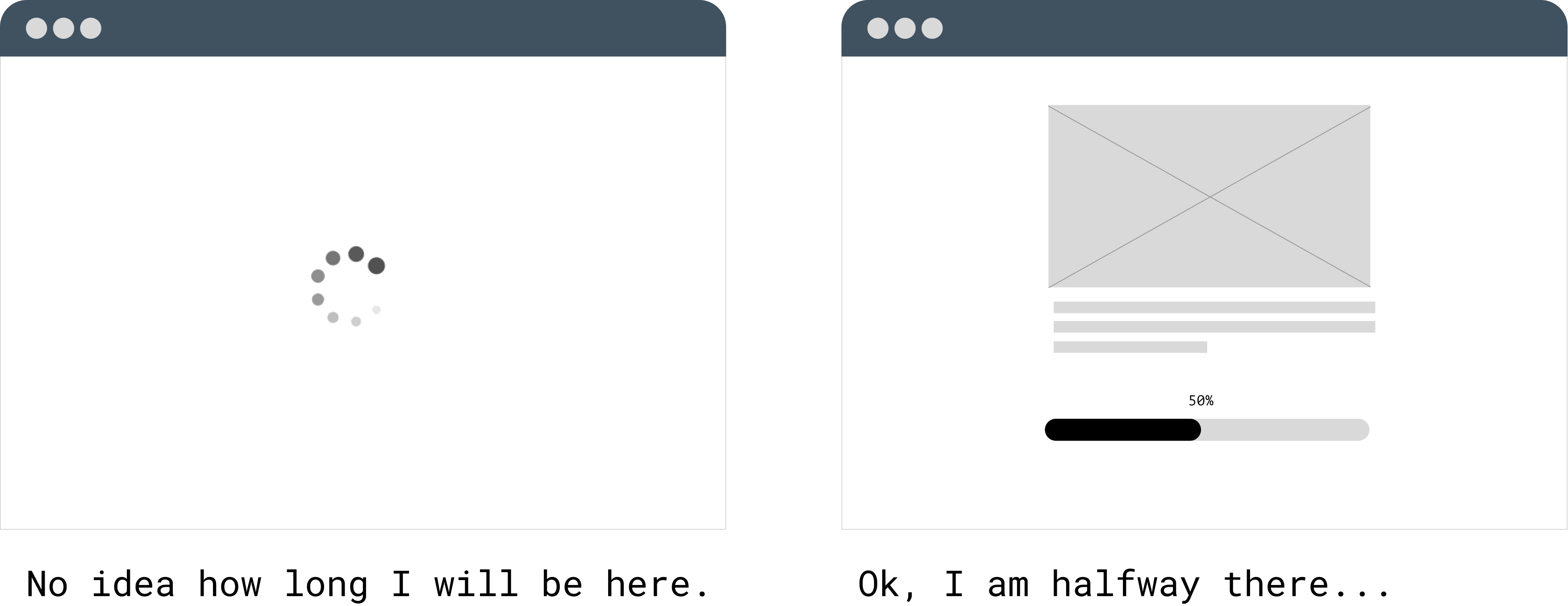
You should use loading animations and confirmations for those longer tasks.

Why should I care?
Products that stay under the threshold feel responsive, trustworthy, and efficient. Products that don’t cause drop-offs, uncertainty, or unnecessary retries. The threshold gives teams a concrete target: respond fast enough to keep people in motion. That single shift can improve engagement, reduce support requests, and increase the likelihood users complete tasks.

How to use this today
Pick one core interaction in your product - something used daily - and ask:
Does the interface acknowledge the action within 400 ms?
If the action takes longer, is there immediate visual feedback so the user knows something is happening?
If not, could a lightweight pattern (optimistic update, inline loader, skeleton screen) keep momentum instead of forcing a hard wait?

Designing with AI: Test Your Product’s Speed with LLMs
Paste URL or connect LLM to your web app:
“You are the world’s foremost expert in UX responsiveness. Analyze this interface for adherence to the Doherty Threshold (400 ms interaction feedback). Identify each user action, estimate perceived response time, and flag any steps where acknowledgement appears delayed or unclear. Suggest specific UI patterns that would maintain user momentum if backend processing takes longer than 400 ms. If anything is unclear, ask questions one by one until you understand the intended behavior.”

Dive in Deeper

About Us
Design Language is a newsletter for all product builders (PMs, Engineers, Founders, etc) who want to improve their design literacy, hone their sense of tase, and improve their craft when building products.
Jeremy Belcher is a 15 year product and design veteran. He runs the product studio Robot Heart, which designs, builds, and validates 0 → 1 B2B workflow tools for teams and founders. He has designed UX/UI for products used by tens of millions for brands like Google, Salesforce, Saturday Night Live, DirecTV, BMW, Emirates, Visa and in the past several years has focused on new enterprise workflow products.
David Issa is a digital strategy and product design leader with over 15 years of experience guiding companies through transformation. He has helped scale products and teams across healthcare, fintech, and enterprise software, translating complex systems into human-centered experiences. David runs a strategic design practice focused on aligning purpose, architecture, and execution—bridging design, AI, and organizational strategy to help teams build with clarity and intent.