E: Error Prevention - Stop people from messing up.
The best way for users to avoid errors is to stop them in the first place
Make it hard to fuck up.
Errors in your product create a frustrating experience, and frustrated users ultimately become your problem. They will blow up your support channels or just stop trusting your product and leave all together.
Design your product so that the wrong action is the hardest one to take.
3 strategies to prevent user error
1. Prevention - Stop people from making a mistake in the first place.
For example, disable Buttons until they are able to be used, only giving the user the ability to use it when they can take an action with it.
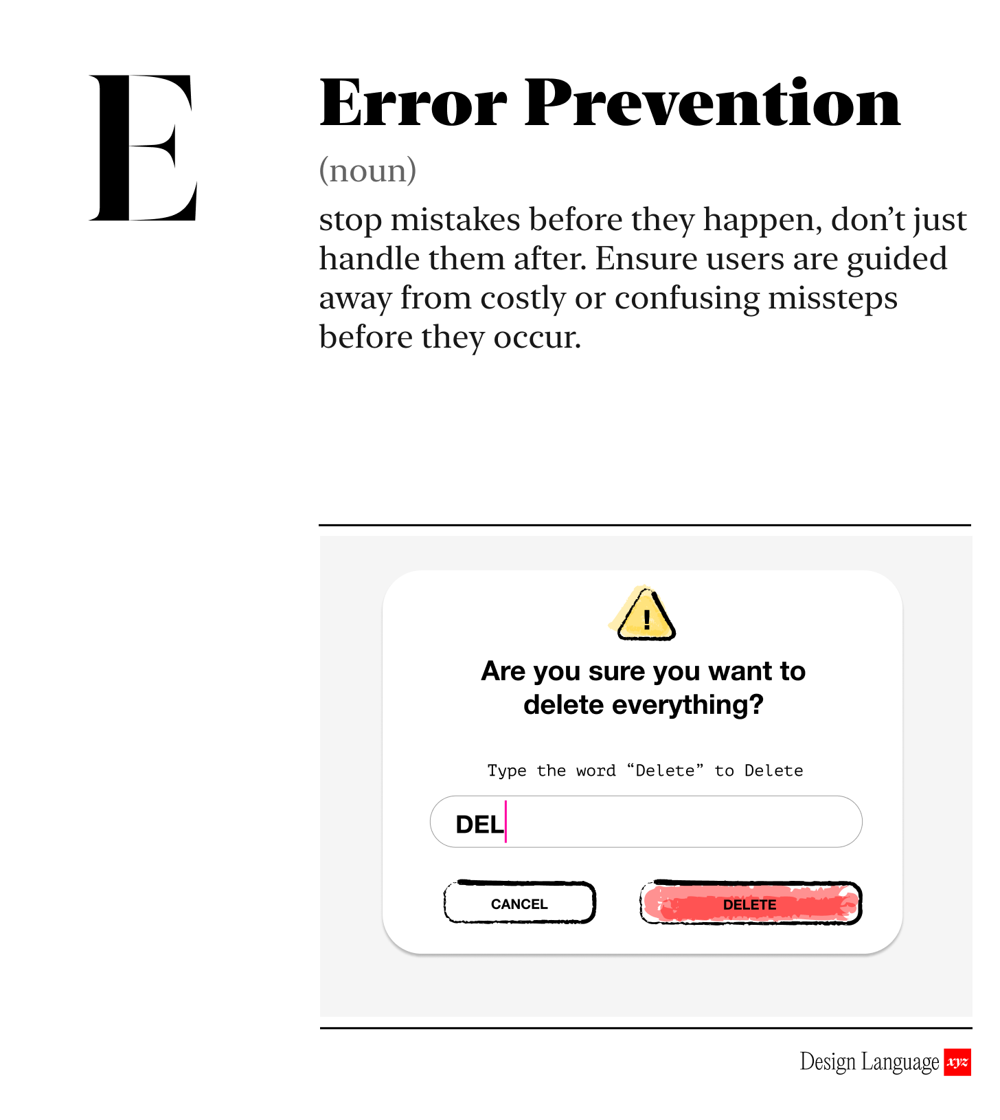
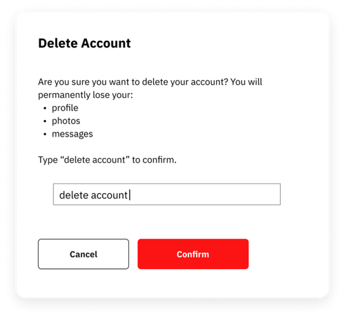
Or ask users to type a specific word, like “delete,” to confirm destructive and irreversible actions. It’s a simple, proven way to stop accidents before they happen.
2. Real time guidance - Highlight errors while users are in the flow, not after.
The ubiquitous red line spell check is a great example of this in action - you know right away that something is wrong, and can fix it before moving on.
If your product experience uses forms, make the input forgiving. Accept numbers and phone formats however users type them. However, when only one input format is valid, guide users or format it automatically. Phone Numbers are a common example, where international differences in format make clarity essential.
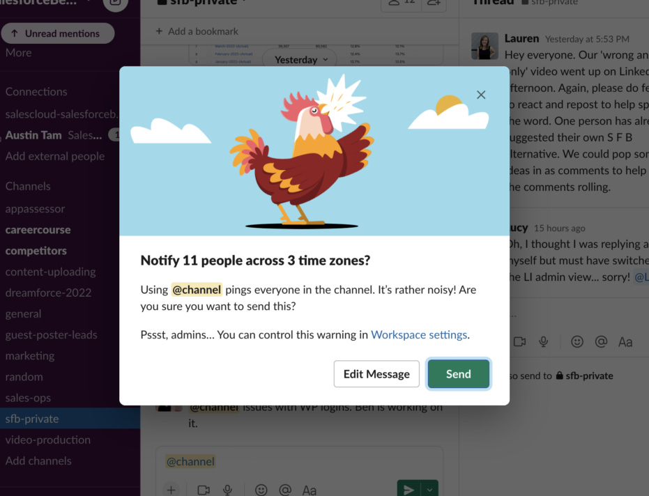
Slack uses confirmation popups mid-workflow. For example, when using the “@channel” command, it a warning pop-up is delivered to ensure you intend to notify everyone in every timezone.
3. Recovery - Help people easily diagnose and fix problems when they do occur.
Even with all these guardrails, people still fuck up. When they do, tell people how to fix the problem, in plain language, with actionable error messages.
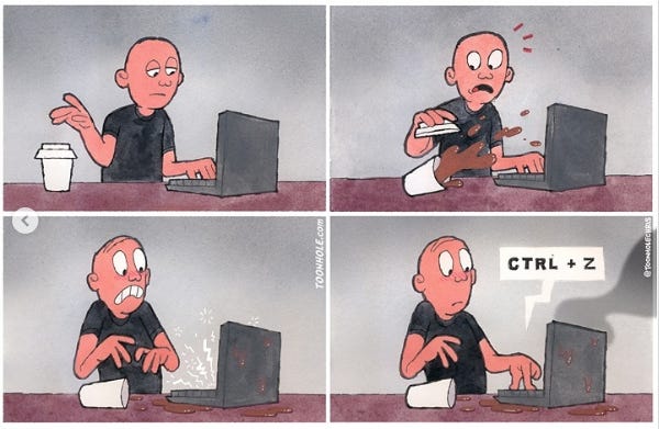
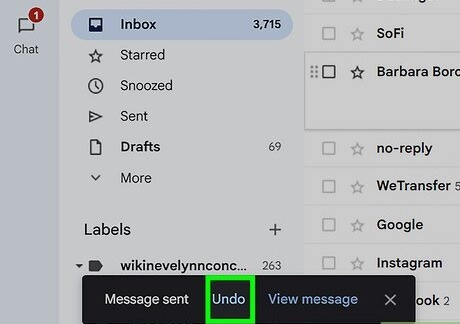
And if they still make it all the way to the disaster we’ve been trying to protect them from? Your ultimate fail-safe is this: let them undo. Make reversal easy, obvious, and fast.
Match error prevention to the severity of the consequences.
While you want to prevent errors, not all errors are created equal. Making a typo is different than deleting a critical record. Error preventions can add friction, so make sure the tradeoff is worth it. Potential big mistakes should have big interventions. Little mistakes need little interventions.
Why should I care?
If someone makes enough mistakes, your experience becomes frustrating or useless. This becomes your problem, in the form of support tickets and churn. An error free experience creates trust, and if they can’t trust your product, they won’t use it.
How to Use Today
Move through the key workflows or user journeys of your product and ask:
Is it too easy to make a mistake, or accidentally delete something important?
Do we balance the error prevention method with the size of the possible error?
Is my product experience forgiving, allowing users to easily engage and recover?
LLM Prompt for Evaluation
Copy/paste this into your model with associated screens or workflows:
Review the following feature, screen, or workflow and evaluate it purely through the lens of error prevention. Identify any places where a user could accidentally make a mistake, misinterpret an action, or submit incorrect information. For each issue you find, suggest one or more improvements that would make the error impossible or much harder to commit.
Focus on:
• preventing errors before they can happen
• validating inputs in real time, not after submission
• limiting destructive actions or making them clearly intentional
• giving users clear constraints, defaults, or guided paths
• matching confirmation or safeguards to the severity of the consequence
Return your response in three parts:
Where a user might mess up
How to prevent it
Suggested improvements to the interaction that makes it harder to mess up
Learn More:
https://www.nngroup.com/videos/usability-heuristic-error-prevention/
https://usabilitygeek.com/error-prevention-in-ux-design-how-facebook-and-gmail-get-it-right/
About Us
Design Language is a newsletter for all product builders (PMs, Engineers, Founders, etc) who want to improve their design literacy, hone their sense of tase, and improve their craft when building products.
Jeremy Belcher is a 15 year product and design veteran. He has designed UX/UI for products used by tens of millions for brands like Google, Salesforce, Saturday Night Live, DirecTV, BMW, Emirates, Visa and in the past several years has focused on new enterprise workflow products. He runs the product studio Robot Heart, which designs, builds, and validates 0 → 1 B2B workflow tools for teams and founders.
David Issa is a digital strategy and product design leader with over 15 years of experience guiding companies through transformation. He has helped scale products and teams across healthcare, fintech, and enterprise software, translating complex systems into human-centered experiences. David runs a strategic design practice focused on aligning purpose, architecture, and execution—bridging design, AI, and organizational strategy to help teams build with clarity and intent.


