

Progress is a hell of a drug
When people get close to a goal, they are more likely to complete it.
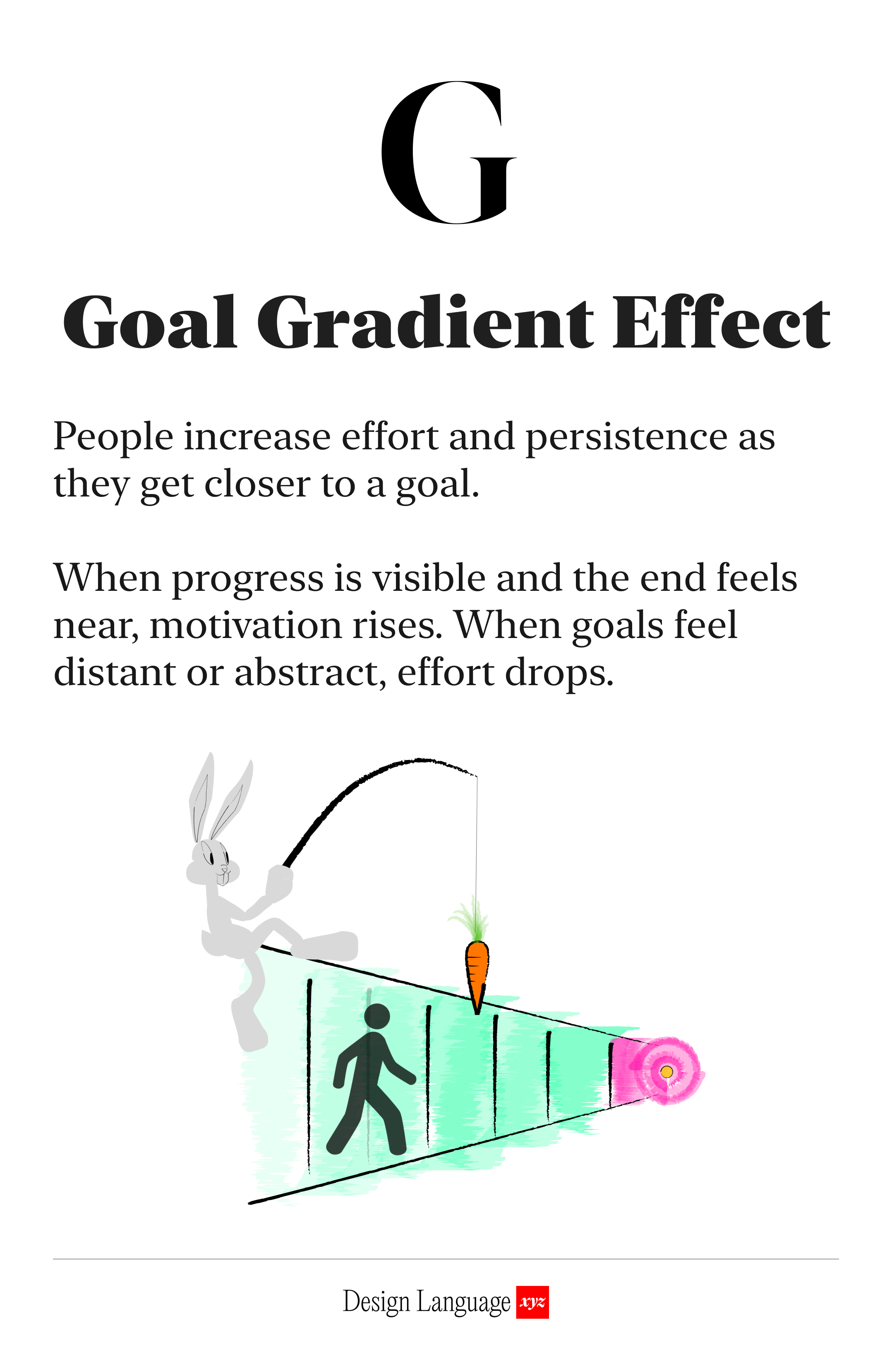
When people get closer to a goal, they work harder to finish it.

When a goal feels too distant, progress is abstract and motivation is weak. This is when most people drop off, because the payoff feels too far away.
The “Goal Gradient Effect” shows that as the finish line gets closer, momentum builds. The work feels worth it because completion feels reachable.

You see this pattern clearly in conversion data. That’s why it’s called a funnel, not a tube. Most abandonment happens early, before progress feels real.
🔜 If you need people to finish, show them they’re getting closer to the goal.
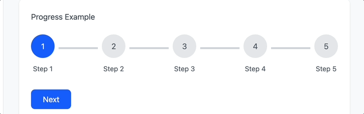
In other words, make progress visible.
Progress indicators work because they provide both orientation and motivation. They answer two critical questions at once:
Where am I?
How much is left?
That context matters. Without it, effort feels endless. With it, work feels finite and achievable.
🎯 Visible Progress Turns Effort Into Commitment
This concept shows up clearly in loyalty programs.

Loyalty cards turn repeat behavior into a visible journey. Each stamp or checkmark signals momentum. The reward at the end reframes effort as accumulation, not obligation.
The “free thing” isn’t just an incentive, it’s a psychological anchor. Once progress is visible, people don’t want to abandon it. The closer they get, the stronger the pull to finish.
This is the Goal-Gradient effect made physical: progress creates commitment, and commitment drives return behavior. People are more likely to visit the café as they get closer to a free coffee.
The same dynamic shows up in airline status programs, to the extent that some people book flights they don’t actually need just to preserve status.
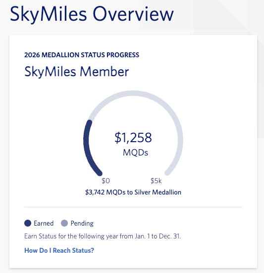
The incentive isn’t the flight. It’s the goal, driven by the visibility of distance from it.
Simply making the goal and distance visible is often enough to change behavior. When people understand what they’re working toward, and how close they are, they’ll often act without additional incentives. The goal itself becomes the motivator.

Why should I care?
If you need people to move through a workflow, complete a sequence of steps, or make a purchase, their willingness to continue depends on whether progress feels real.
When the path is vague, people hesitate. When the goal is visible and distance is clear, effort increases. This is true whether you’re designing a checkout flow, an onboarding sequence, or a creative tool.
Design isn’t just about removing friction. It’s about creating momentum.

Use this today
Ask yourself:
Can you reward people sooner, before motivation drops?
Can you break large goals into smaller, more frequent wins?
Can you make progress visible, not implied?
If people can see movement, they’ll keep moving. If the goal feels closer, effort feels justified. Design for momentum, not patience.

LLM Prompt
You are a senior UX designer and behavioral design expert.
Analyze the following website or flow with a focus on momentum, progress visibility, and goal completion.
Your task is to identify where users may lose motivation and where design could better leverage progress-based psychology (goal-gradient effect, early rewards, visible advancement).
Context
Website type: [marketing site / SaaS app / ecommerce / onboarding flow / newsletter / other]Primary user goal: [what users are trying to complete]Key conversion action: [signup, purchase, submit, finish, etc.]
Ask any questions, one at a time, that will help clarify this ask.
Respond with:
A short executive summaryKey friction pointsConcrete, testable design suggestions

Learn More

About Us
Design Language is a newsletter for all product builders (PMs, Engineers, Founders, etc) who want to improve their design literacy, hone their sense of tase, and improve their craft when building products.
Jeremy Belcher is a 15 year product and design veteran. He has designed UX/UI for products used by tens of millions for brands like Google, Salesforce, Saturday Night Live, DirecTV, BMW, Emirates, Visa and in the past several years has focused on new enterprise workflow products. He runs the product studio Robot Heart, which designs, builds, and validates 0 → 1 B2B workflow tools for teams and founders.
David Issa is a digital strategy and product design leader with over 15 years of experience guiding companies through transformation. He has helped scale products and teams across healthcare, fintech, and enterprise software, translating complex systems into human-centered experiences. David runs a strategic design practice focused on aligning purpose, architecture, and execution—bridging design, AI, and organizational strategy to help teams build with clarity and intent.