

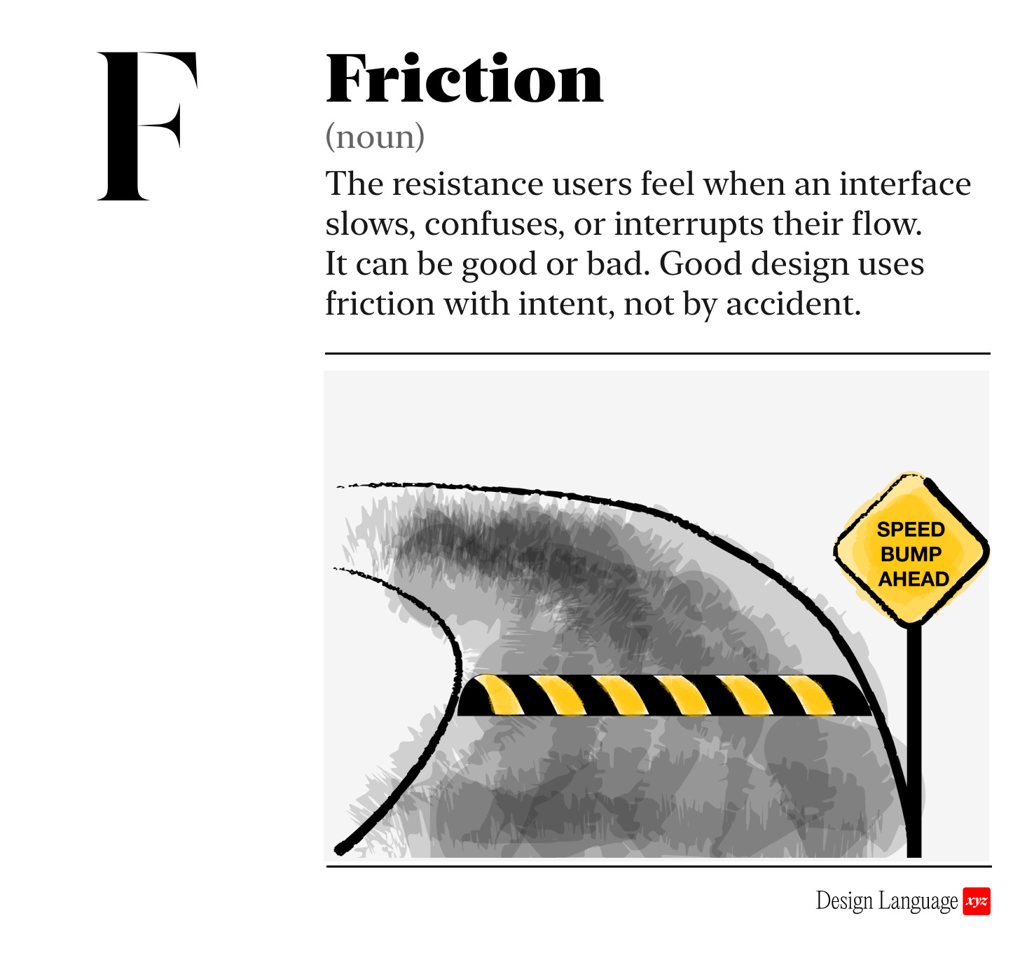
F: Friction can be a feature or a bug
Friction is a tool.
Friction slows people down. You may or may not want that.
Friction is the resistance users feel when an interface slows, confuses, or interrupts their flow. It can be physical (more clicks), cognitive (hard to understand), or emotional (annoying).
Friction isn’t inherently good or bad on its own. Used correctly, it’s an effective tool to improve your product’s experience. Used poorly, it causes frustration, mistakes, and drop-off.
Good friction vs. bad friction
😇 Good friction slows users on purpose:
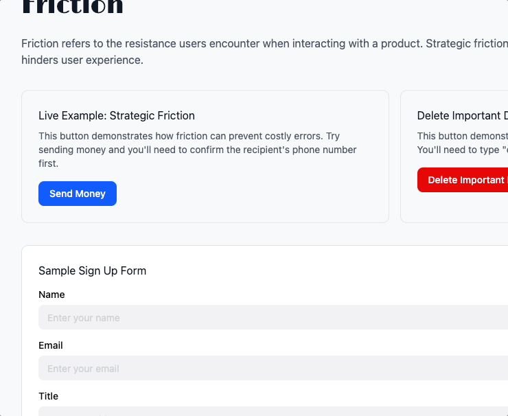
A moment of pause with ability to undo before sending money
A confirmation dialog or typing “DELETE” before deleting critical data
All of these slow the flow towards the user goal for a reason, like ensuring safety and confirming user intent. If there are parts of your experience where mistakes are costly, you want to ensure the user moves mindfully. Used this way, friction is a form of error prevention.
See examples in our companion Guide
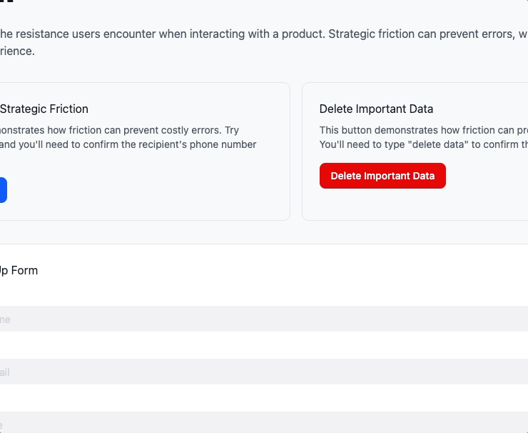
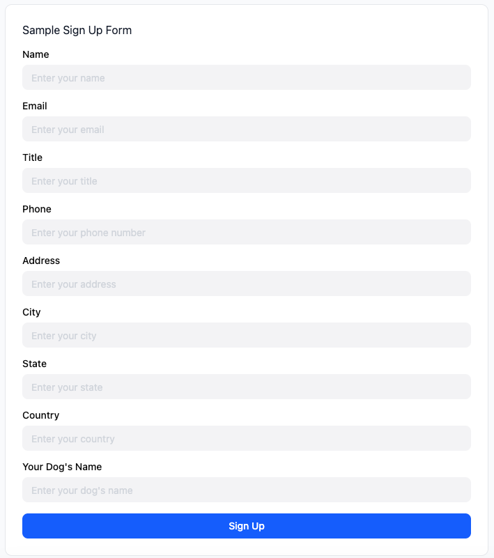
😤 Bad friction slows users unnecessarily, worsening the experience and impeding key actions
Long, mandatory form fields that aren’t necessary
A disabled button with no explanation
A five-step checkout when one would do
Bad friction results in pissed off users. They wonder “wtf why is this so hard!?” and you’ll lose them. If the user doesn’t understand the interface or why the system is slowing them down, you are eroding trust with each step.
For example, you would not sign up for whatever this is:
See example in our companion Guide

Why should I care?
Removing unnecessary friction improves speed, confidence, and user trust.
Adding intentional friction in the right moments reduces mistakes, increases safety, and gives users time to think before acting.
It’s not about having no friction in the experience. It’s about the right amount, in the right place, for the right reason.

How to use this today
When reviewing a screen or flow, ask:
Are there any extra steps or unclear moments that don’t serve a purpose?
Is there friction that should exist (e.g. to prevent a destructive action) but doesn’t?

Designing with AI: Test Your Product for Friction
Take a screenshot of your interface and paste it into ChatGPT or Claude with this prompt:
“Act as a senior UX strategist. Evaluate this interface for potential negative user friction. Identify where the experience slows users down, creates confusion, breaks flow, or adds cognitive load. Distinguish between intentional friction (helpful, protective, clarifying) and unintentional friction (accidental, distracting, redundant). Recommend precise adjustments that increase clarity, speed, and ease of use. If anything is ambiguous or missing, ask targeted questions before drawing conclusions.”

Dive in Deeper
The Best Interface is No Interface by Golden Krishna

About Us
Design Language is a newsletter for all product builders (PMs, Engineers, Founders, etc) who want to improve their design literacy, hone their sense of tase, and improve their craft when building products.
Jeremy Belcher is a 15 year product and design veteran. He has designed UX/UI for products used by tens of millions for brands like Google, Salesforce, Saturday Night Live, DirecTV, BMW, Emirates, Visa and in the past several years has focused on new enterprise workflow products. He runs the product studio Robot Heart, which designs, builds, and validates 0 → 1 B2B workflow tools for teams and founders.
David Issa is a digital strategy and product design leader with over 15 years of experience guiding companies through transformation. He has helped scale products and teams across healthcare, fintech, and enterprise software, translating complex systems into human-centered experiences. David runs a strategic design practice focused on aligning purpose, architecture, and execution—bridging design, AI, and organizational strategy to help teams build with clarity and intent.