

Interface-Off: What LLM designs the best marketing site?
Testing the design skills of Claude 4.6, Gemini 3, and Codex 5.2
AI coding tools are legitimately amazing, but their default designs are not.
But with the right language, you can get something far better than the usual “vibe code purple.”
But which LLM is the better designer?
The test:
Claude code built a skeleton of the page with no styling, only content and layout based on a PRD it also wrote.
We gave the exact same prompt and reference images to the different LLMs
Claude 4.6 Opus in Cursor
Gemini 3 Pro (High) in Antigravity
Codex 5.2 in Cursor
Chose a very bold and intense style choice, “Memphis,” which is like an 80’s fever dream in Pee Wee’s Playhouse. It gave the most opportunity for “creativity.”
After each design was created, I took a screenshot and I reverted the code back to the original skeleton (I was having trouble with git branching).
All of these were “one-shot” prompts. I did not give any additional instructions and there were no revisions. I did not explicitly put anything into plan mode (although some did it on their own).
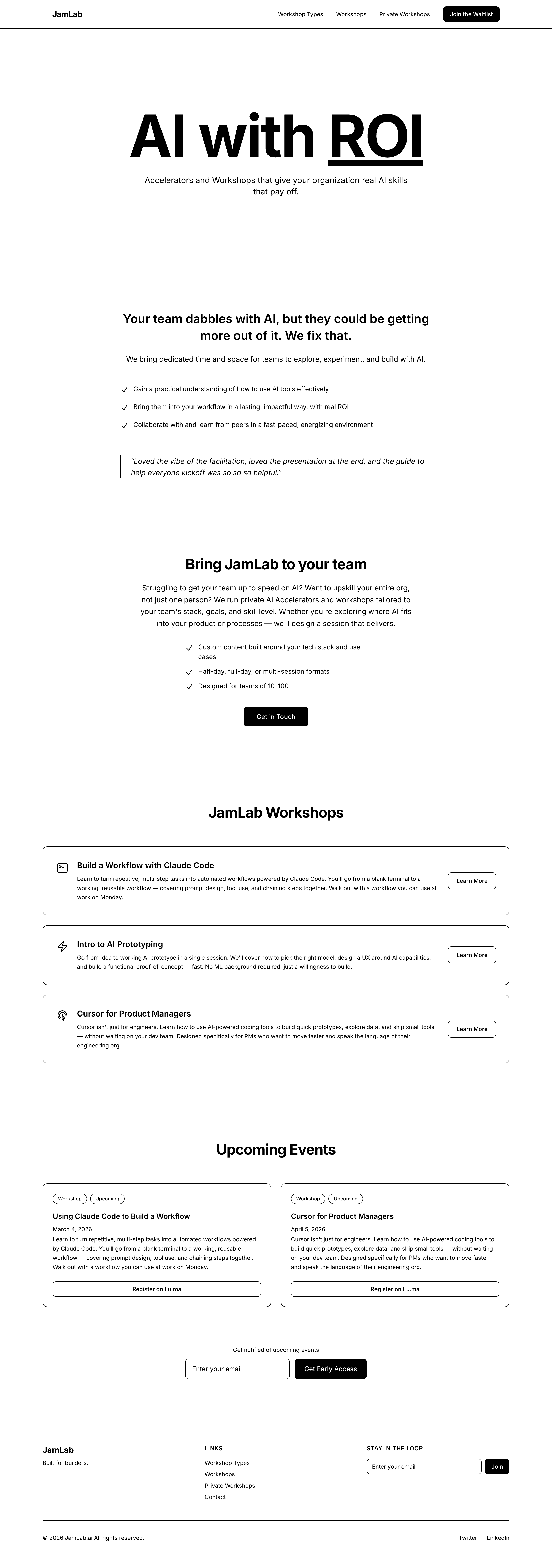
1. The skeleton
Used Claude Code to create a PRD and used Claude Code to generate the unstyled, coded skeleton page.

2. Gave same prompt to 3 LLMs
Claude 4.6 Opus (via Cursor)
Gemini 3 Pro (via Antigravity)
Codex 5.2 (via Cursor)
The prompt:
You are an expert web designer specializing in bold, expressive visual styles.
Your task: Apply Memphis design style to this website
What is Memphis style:
Chaotic, colorful, and unapologetically weird
Rejects conventional “good taste” in favor of visual energy
Uses clashing geometric patterns, bold shapes, and unexpected color combinations
Think “Pee-Wee’s Playhouse” meets 1980s Italian design collective
High contrast, eye-catching, playful typography
Requirements:
Do NOT change content, copy, or content hierarchy - only modify visual styling (colors, fonts, patterns, shapes, spacing)
Maintain core UX principles: affordances must remain clear, buttons must be obvious, navigation must be intuitive
Meet accessibility standards (WCAG AA minimum) - ensure sufficient color contrast for text, maintain keyboard navigation, preserve semantic HTML
Include full mobile responsive styles - the design must work beautifully on all screen sizes
Reference images: [See attached images for visual inspiration]
Output: Updated CSS/styling that transforms the visual language while preserving usability and accessibility.
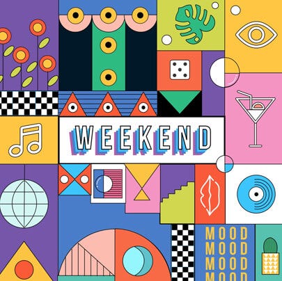
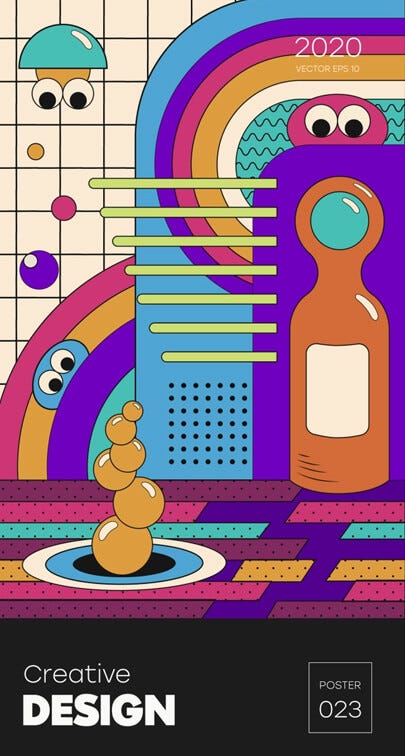
Reference images
Sourced from: https://graphicmama.com/blog/memphis-design-examples/

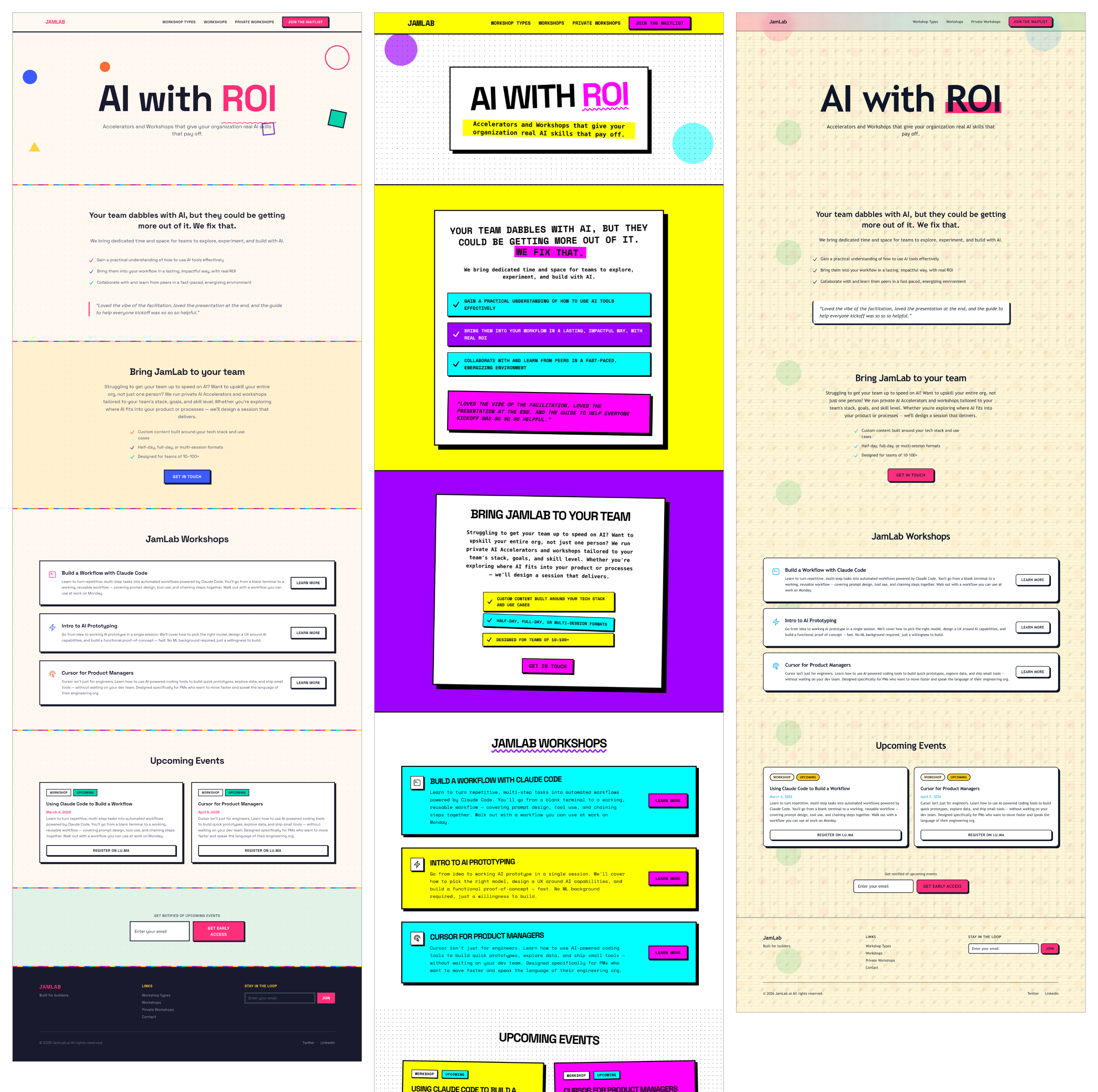
The Results
Claude Opus 4.6 in Cursor
Gemini 3 in Antigravity
Codex 5.2 in Cursor
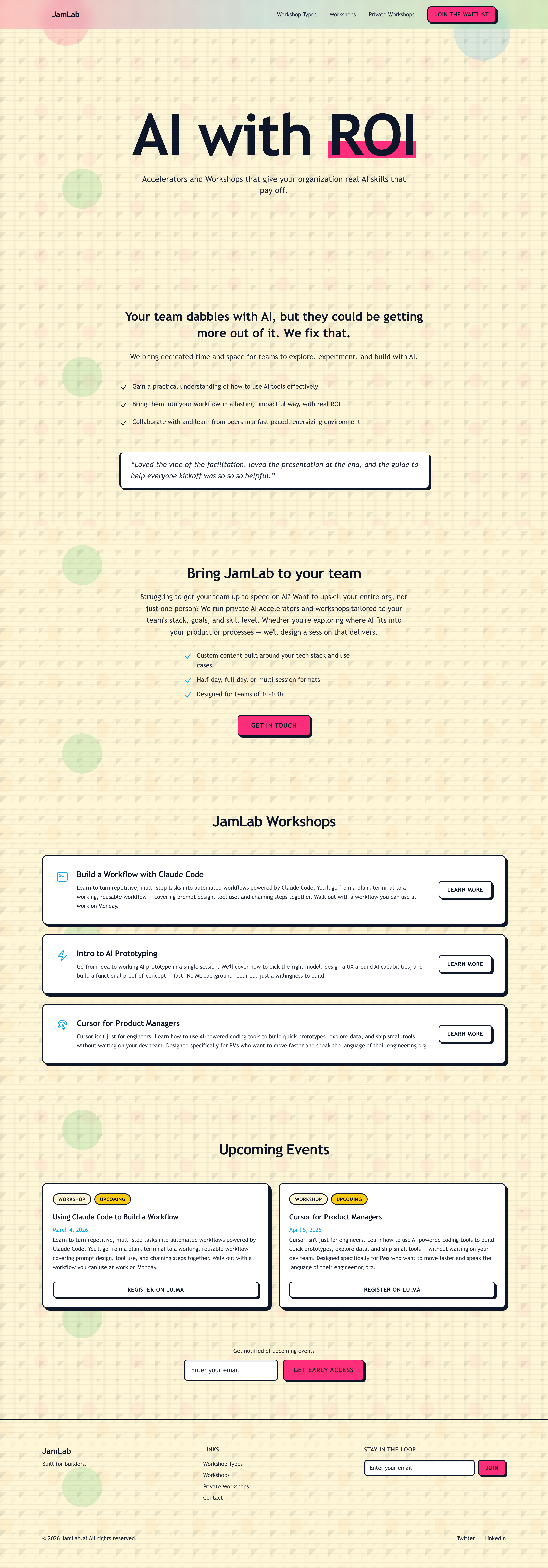
Very different results! Gemini and Claude’s output are quite good, they could work for a basic marketing page. Codex’s output was pretty bad.
Note: Personally, we’re not sure “Memphis” is the right style for this site, so we’ll try this exercise with a different style.
Want to try it out?
Grab the prompt and the reference images above and share your results in the comments.