

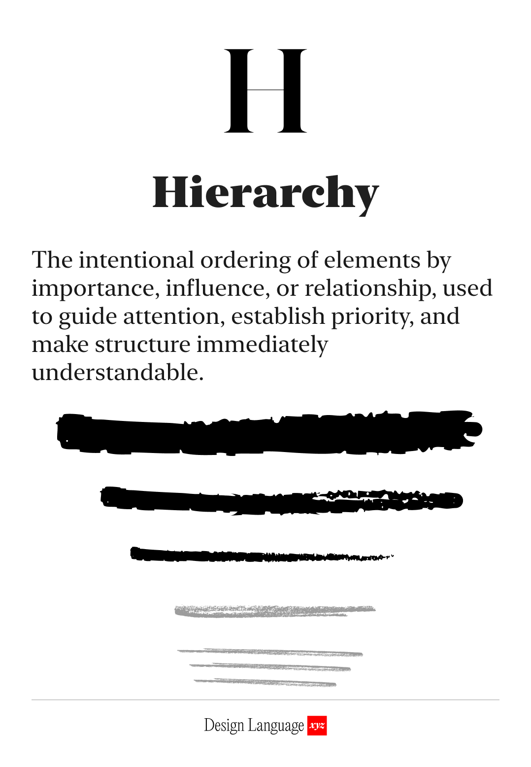
Size does matter: how to use Hierarchy to direct attention
Visual hierarchy is the art of making sure users notice things in the right order
This headline is big because we want you to read it first.
People scan before they read. You probably just did.
Strong hierarchy guides people to what’s important. If elements look too similar, nothing stands out, and people won’t know what to focus on.
Hierarchy is a form of navigation, as it directs and orients people.
Used well, people find the most important element first, like a headline or call-to-action, then to secondary info, and so on. In a content heavy experience, effective use of hierarchy will orient users and help them find their way.
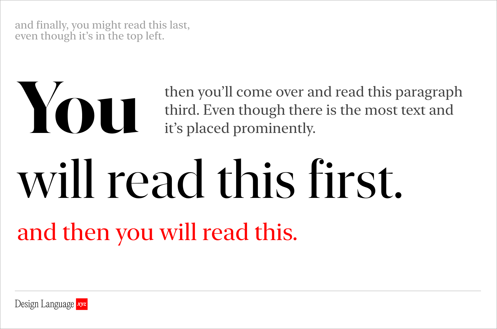
Visual hierarchy is achieved by contrasting elements so that some visually dominate over others.
You can use size, placement, and color.
A larger or bolder element will naturally draw attention first (e.g. a big headline at the top of a page). Strong color contrast can do the same. The big blue button below stands out on an otherwise black and white page.
The size, weight, and style of your fonts and components create a visual roadmap, guiding attention, signaling importance and waypoints, and shaping how people navigate your product.
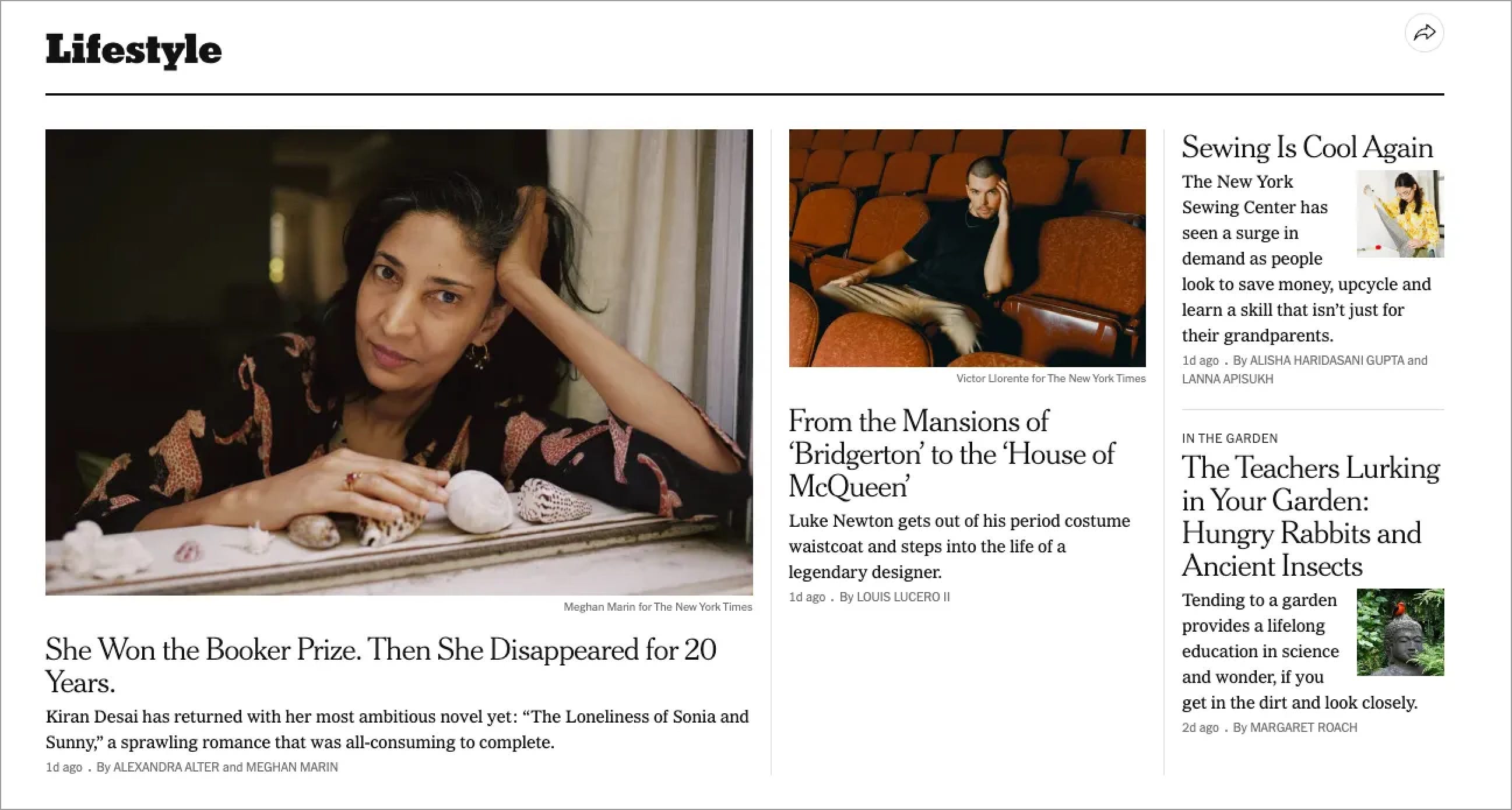
Info-dense sites like the New York Times use hierarchy for orientation, organization, and way-finding. The title of the section, “Lifestyle,” is large, serif, and bold (seen first), the article title is smaller (seen second), and the article description text is regular and small (read next). Dates and writers names are even smaller and lighter (last). This design is not that different from a dashboard in a SaaS context, and the same principles apply.
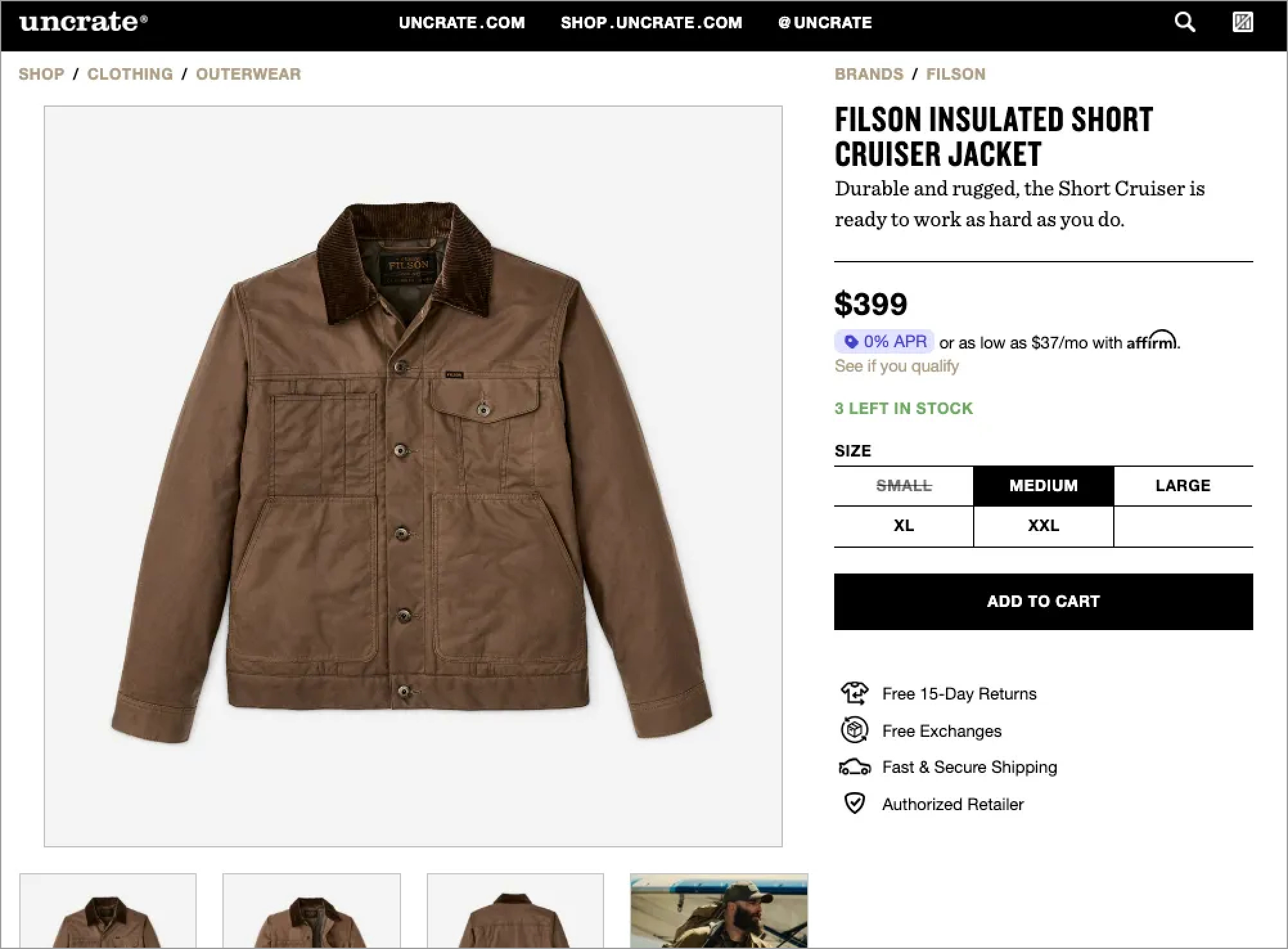
On Uncrate, an ecommerce site, the product image is the hero. It commands the majority of the screen real estate and draws you in, which makes sense. Then the product name and price, the next 2 most important elements, are big and high-contrast with bold black font on a white background. The description is smaller, and details like SKU or fine print are subdued. The “Add to Cart” button is the single primary action on the page.
You control the flow of information consumption. Because every screen tells a story, and visual hierarchy decides the order in which it’s consumed.

Use this today
Before shipping any screen or page, ask: “What should users notice first?” Make that element bigger, bolder, or more contrasted than everything else.
If you’re working with dense content, like dashboards, documentation, or settings, ask instead: “How do users mentally organize this?” Match your visual hierarchy to that mental model. Group related items, use different sizing for different importance levels, and make section breaks obvious.

LLM Prompt
You are a world-class UX architect and information designer analyzing visual hierarchy.
Examine the attached screen and provide:
Scan path analysis: Describe what element draws your eye first, second, and third. What is the primary focal point?
Goal alignment: Based on what this screen appears to be (e.g., checkout flow, dashboard, marketing page), does the current hierarchy support its likely purpose? If the hierarchy seems misaligned, explain why.
Specific recommendations: Suggest concrete changes to improve hierarchy, such as:
“Increase the CTA button size and use a high-contrast color”
“Reduce header weight—it’s competing with the main content”
“Group related items closer together to create clear sections”
Focus on actionable adjustments to size, weight, color, contrast, spacing, and position.
Before you begin, ask me up to 5 clarifying questions, one by one, about the screen’s purpose or target user action until you have enough information. Then provide your full analysis.

Learn More
https://www.interaction-design.org/literature/topics/visual-hierarchy
https://www.figma.com/resource-library/what-is-visual-hierarchy/

About Us
Design Language is a newsletter for all product builders (PMs, Engineers, Founders, etc) who want to improve their design literacy, hone their sense of tase, and improve their craft when building products.
Jeremy Belcher is a 15 year product and design veteran. He has designed UX/UI for products used by tens of millions for brands like Google, Salesforce, Saturday Night Live, DirecTV, BMW, Emirates, Visa and in the past several years has focused on new enterprise workflow products. He runs the product studio Robot Heart, which designs, builds, and validates 0 → 1 B2B workflow tools for teams and founders.
David Issa is a digital strategy and product design leader with over 15 years of experience guiding companies through transformation. He has helped scale products and teams across healthcare, fintech, and enterprise software, translating complex systems into human-centered experiences. David runs a strategic design practice focused on aligning purpose, architecture, and execution—bridging design, AI, and organizational strategy to help teams build with clarity and intent.