
This is the companion piece to our first Design Language video, a live teardown of Slack through the lens of product design. Watch it above, or read on.
---
Slack is open on your computer right now. Probably has been all day.
Most people use it without ever thinking about *why* it works, or why certain parts of it make them want to throw their laptop. We’re here to change that.
We’re applying the concepts we talk about in the newsletter to one of the most-used products in the world, and seeing what holds up, what breaks down, and what you can steal for your own work.
Let’s get into it.
---
What Slack Gets Right
Speed is invisible design. Slack gets this.
When you hit send, the message is there. Instantly.
This is the Doherty Threshold - the principle that systems responding under 400ms keep users in a state of flow. Slack has nailed this from day one. Everything feels snappy in a way that builds trust without you ever consciously noticing.
And when something *does* go wrong, like when a message is delayed or the service is down, Slack tells you. The status indicators are honest and visible. You know what’s happening. That’s not trivial. That’s a design decision.
The layout teaches itself.
A new user opens Slack and within seconds, they know what to do. Workspaces on the far left. Channels in the middle. Conversation on the right.
That’s Common Region. Elements in a shared boundary are perceived as belonging together, so the layout communicates structure without any documentation. Each panel tells you what it does just by where it lives.
Dig deeper and there are actually four levels of hierarchy:
workspaces → channel navigation → channel sub-nav → conversation.
Managing that much information without it feeling overwhelming is genuinely hard design work. Slack mostly pulls it off.
It doesn’t feel like enterprise software. That was the point.
Before Slack, enterprise software looked like Oracle. Gray interfaces, no personality, zero joy. You used it because you had to.
Slack changed the category. The confetti on onboarding. The wood-knock notification sound. Emoji reactions as a legitimate communication tool. GIFs in a corporate Slack channel in 2014 felt genuinely radical.
This was first consumerization of enterprise software. It worked because it tapped into something psychological. Slack felt like an AOL chat room. And for most of us, AOL chat rooms were *fun*. Bringing that feeling into a work context made people actually want to open the app.
“The business casual of the digital world” is how we put it in the video. That still feels right.
Error prevention done well: the @channel modal.
Type `@channel` in a Slack workspace with hundreds of people and you’ll get a modal asking if you really want to notify all of them — including the ones who are currently asleep in other time zones.
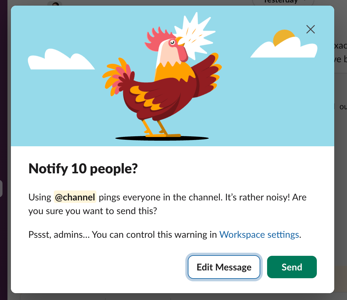
This is a great example of error prevention and friction used exactly as it should be. A moment of intentional resistance that asks: *did you mean to do that?* It doesn’t block the action. It just makes you confirm you’re being intentional.
Same principle behind @mentions. The ability to post in a channel but ping one specific person was a design breakthrough. Everybody sees the message. Only the right person gets the notification. That’s a hard balance to get right, and Slack nailed it.
---
Where Slack Falls Short
Search is an afterthought.
There is an enormous amount of organizational knowledge living inside Slack. Decisions, context, files, links, conversations that resolved real problems.
Almost none of it is findable.
Slack optimized for real-time communication and underinvested in retrieval. The result is that most experienced users have invented workarounds — saving messages to “Later,” pinning things to channels, trying to remember which channel a conversation happened in. These are symptoms, not features.
The irony is that this is exactly the problem AI should solve. Surfacing context from your history, connecting threads across time, making the knowledge repo actually retrievable — that’s a version of Slack AI worth paying for. We’re not there yet.
Threads can be tough to follow.
The idea is sound. Keep side conversations from flooding the main channel. Create breakout threads for specific discussions.
In practice? Many people miss threads entirely, or post replies in the wrong place, or get confused by the “also send to channel” checkbox that puts replies *back* in the main feed, which kind of defeats the point.
Integrations overwhelm the chats
For example, look at how much of the viewport a single embedded link preview takes up. Now imagine you have three integrations piping updates into the same channel.
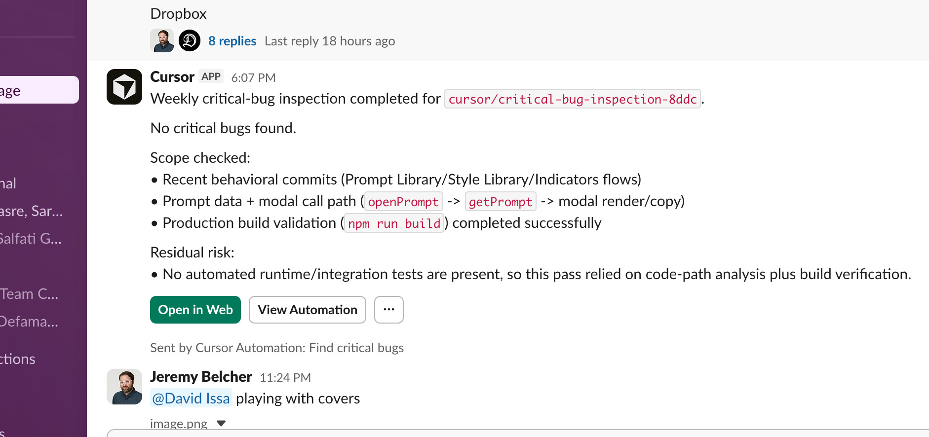
Slack’s navigation is restrained and clean. Yet the embedded content is oversized and clunky. Integration notifications dump entire blocks of metadata into the stream with no hierarchy, no filtering, no threading by default. The signal-to-noise ratio collapses.
The fix isn’t complicated: collapse integration output by default, thread it automatically, and surface exceptions rather than everything. Alert by exception. Slack hasn’t done this, and it’s not totally their fault as they don’t control how third-party integrations render their output. But people start ignoring whole channels because the content-to-noise ratio isn’t worth it. And the moment people start ignoring channels, the whole value proposition of Slack starts to erode.
AI features that don’t know what they are yet.
The strategy is visible: make Slack the operating system for the entire enterprise, with AI as the connective tissue.
The reality, right now, is that it mostly adds noise.
The AI features feel bolted on rather than considered. If you have Claude installed in your workspace, it’s not obvious how it works, whether it’s using your API credits, what it can actually see, or why you’d go there instead of a dedicated Claude interface. The UX doesn’t answer the questions that naturally come up.
What *would* be interesting: an AI that surfaces relevant context from your channel history, connects decisions across threads, or triages what actually needs your attention. That version of Slack AI is worth building. The current version mostly sits there looking uncertain about its own purpose.
---
The Bigger Problem With Slack
Always-on messaging might just be bad for how humans work.
Slack is useful. It’s also the best distraction machine ever built. It fragments attention constantly. It creates an implicit expectation of immediate response. It’s hard to opt out without looking like you’re ignoring people, because you kind of are.
The notification problem isn’t really a product design problem. It’s a social design problem. Your boss sends a message at 10pm. Is it urgent? Is it a brain dump? Is it something they’re noting for themselves but happened to drop in the channel? You don’t know. So you check. And now you’re working at 10pm.
Slack didn’t invent this problem. But they built the rails it runs on. And the do-not-disturb features that exist: away status, notification schedules, pause notifications, all require individual configuration in a product where the default is everything, all the time.
What would actually help: treating “I’m in focus mode” as a first-class status the way “out of office” is. Not just an away message, but something that tells the person messaging you that you’re working and will respond later, which would normalize the idea that deep work is protected time, not available time.
As AI agents start populating Slack workspaces, this tension is only going to get worse. The 10pm notification could be production down. Or it could be an agent telling you it ran a scheduled task. The cost of ignoring either is different. The design doesn’t help you tell them apart.
---
The Verdict
Slack is still the best tool of its kind. We’re not switching.
The information architecture is genuinely strong. The performance is reliable. The learning curve is low. And its ubiquity is a massive, durable advantage.
But it’s a product under real pressure. The consumer-enterprise tension that’s always defined it is getting harder to resolve. Salesforce’s ownership has added enterprise gravity. The AI layer hasn’t found its footing. The always-on paradigm creates cultural problems the product doesn’t address.
The design wins are real and worth studying. So are the failures. Both tell you something useful about what happens when a product scales faster than the assumptions it was built on.

About Us
Design Language is a newsletter for all product builders (PMs, Engineers, Founders, etc) who want to improve their design literacy, hone their sense of tase, and improve their craft when building products.
Jeremy Belcher is a 15 year product and design veteran. He has designed UX/UI for products used by tens of millions for brands like Google, Salesforce, Saturday Night Live, DirecTV, BMW, Emirates, Visa and in the past several years has focused on new enterprise workflow products. He runs the product studio Robot Heart, which designs, builds, and validates 0 → 1 B2B workflow tools for teams and founders.
David Issa is a digital strategy and product design leader with over 15 years of experience guiding companies through transformation. He has helped scale products and teams across healthcare, fintech, and enterprise software, translating complex systems into human-centered experiences. David runs a strategic design practice focused on aligning purpose, architecture, and execution—bridging design, AI, and organizational strategy to help teams build with clarity and intent.