

Most Products Have Features. Few Have Manners.
This is the companion piece to Acquired Taste, our episode on micro-interactions and what “taste” actually means. Watch the video above, or read on.
You have heard it a hundred times by now. The only skill that matters anymore is taste. Product taste. Design taste. Say it with enough confidence and people nod.
Then someone asks what it actually means, and nobody can explain it.
Here is our honest attempt at an answer, at least for the part of taste that lives in design: it is an opinion about the details, informed by experience. Between us we have spent more years than we want to admit noticing the small stuff inside products. Taste is having a point of view about those, and knowing where they belong.
So this episode was a chance to geek out on the ones we love, pull them apart, and figure out what separates the good from the merely cute.
Why this matters more now than it ever has
For most of software history, the details were the last 5% of the work, which you got to if you had time, budget, and an engineering culture that cared. Usually you did not have all three. The little interactions that make a design shine were expensive to build, the payoff was hard to measure, and so they got cut.
That equation just flipped.
Designers can reach into the code themselves now. Engineers run agentic pipelines that hand them the boring parts back as free time. The economics are upside down, and you are building backward from there.
Which means the excuse is gone. AI did not lower the bar for craft. It removed the reason you used to skip it, and that quietly raises the bar for everyone.
Details telegraph care.
When someone spends real time on the small interactions, you assume the rest of the product works too, because people who sweat this part tend to sweat the parts you cannot see. It reads as quality. And people trust quality. In a world where anyone can barf out a working app in an afternoon, the details are one of the few honest signals left that says actual humans thought about this.
Now to the examples. We each brought a few.
Sentry: respecting the user enough to skip the pitch
Sentry is application monitoring software. The kind of tool you reach for when you want to know why your product is breaking. Their marketing site is a whole production: animated, loud, terminal-styled, dripping with personality.
And then there is a toggle that turns all of it off.
Flip off marketing mode and the page collapses into a plain chatbot. No value props, no hero animation, nothing. Just a box that asks what you want to know. Type “what platforms do you support” and it answers. You skip the entire funnel and go straight to the facts.
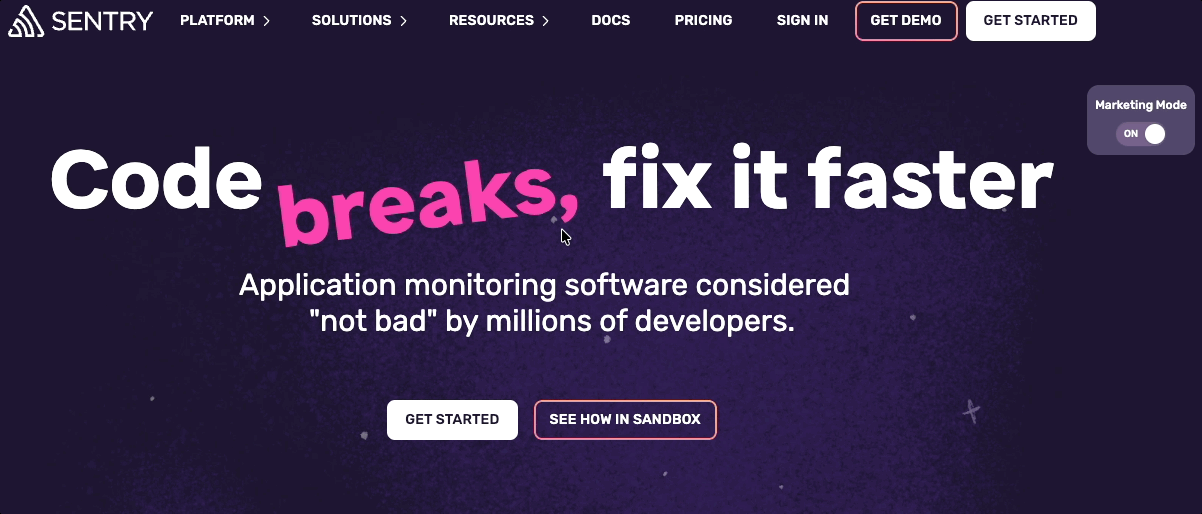
Is it micro? The interaction itself is, one toggle, but the decision behind it is anything but simple. That is what makes it work. This is a company that clearly knows its users. The serious engineer evaluating a tool at work, who probably loves all that animated, anime-flavored stuff in their off hours, does not want it when they are busy deciding whether to buy. Sentry gives both audiences exactly what they came for.
One caution worth saying out loud: an interaction like this only pays off if it actually works. If the chatbot answers are vague or wrong, the whole clever idea collapses. The risk scales with the ambition.
PostHog: one button that does the entire job
PostHog is an open-source analytics platform. Full disclosure, we find the product itself borderline unusable. We have tried to get into it several times and bounced off the sheer density of features and the thin onboarding. Hold that thought, because it matters.
On the homepage there is a button called Install with AI. Instead of walking the traditional path of forms and setup steps, you click it, get a single prompt, and drop that prompt straight into Claude or Codex or whatever you use. The AI installs PostHog into your codebase for you. A three-click install, basically, for someone who already knows they want the product.
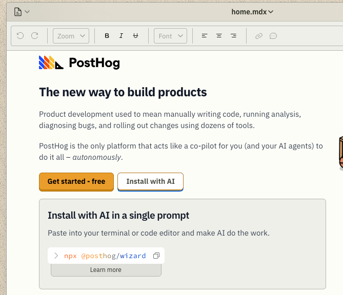
This is the usability half of the equation working hard. It is built for the person at a specific spot in the journey, the one who already decided. And that rotating rainbow gradient over the button is a perfect example of a true micro-interaction. A subtle shift that pulls your attention to the one thing that matters, while quieter elements sit below the fold so nothing competes.
But here is the honest tension. The single-click install is modern usability at its sharpest, and it is dropped into a cluttered retro desktop full of icons where it is genuinely hard to know where to look first. The messiness we feel in the product leaks into the marketing site. We love the install button. We would love it more if it were not buried in noise. Funny how the thing we find hard about the product shows up right there on the homepage.
Google Docs: draw the table, do not describe it
Insert a table in Google Docs and you do not fill out a form asking how many rows and columns. You draw it. Drag across a grid and watch the table take shape, with the count shown as you go so you do not even have to tally the boxes.
It is not unique to Google Docs, and we are not sure who did it first, but it is a small joy. They could have made you type two numbers into two fields. Instead your mouse is already moving across the grid, you can see exactly what you are building, and it is done. Fast, direct, and slightly magical.
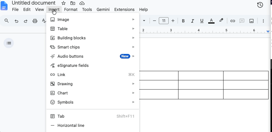
The catch is that the great first interaction does not fully pay off. Once the table is on the page, editing it gets clunky. Adding rows is fine, but deleting one sends you hunting through a right-click menu. The design starts strong and then leaves you stranded.
Worth being fair to Google here. Tools like Docs have billions of users, and at that scale any change, even a clear improvement, generates a hundred thousand angry emails from people who had the old way memorized. There are surely designers inside Google who hate this exact friction and cannot touch it. That is its own kind of taste lesson: sometimes the constraint is not the design, it is the blast radius.
Confetti, used like you mean it
This next one is something Jeremy built. For the AI workshops he runs at Jamlab.ai, there is a custom guide that walks through each session step by step. Mark a section complete and you get a small burst of confetti, then the page scrolls you to the next step.
Confetti is the easiest delight to get wrong, so the context matters. This is an academic setting, and every burst marks a real milestone the learner actually completed. The reward is earned. It would feel absurd to fire confetti when someone finishes a credit card payment (”congratulations, you spent money”) or fills out a doctor’s intake form with a broken arm. Used in an unearned moment, confetti is pure decoration, a sugar high that makes the interface feel childish two seconds later.
Two things kept it honest here. It is deliberately small, a poof rather than a screen takeover. And it does a job beyond the celebration: it confirms you are done and moves you forward, so there is no uncertainty about whether the step registered. That is real feedback, not just sparkle.
Tools that move at the speed of thought
The other thing we built is an internal tool for making user flows, the kind of flow charts you would normally build in Figma or Miro. It does two things we care about. When you select a node, the next node is right there, one click or one keyboard shortcut away, so you can draft a flow live on a client call while you are still talking. And everything saves to Mermaid and Markdown, so you can hand it straight to an LLM.
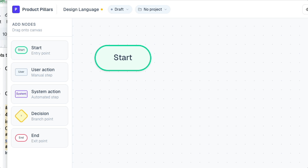
This one is about speed, not delight. Removing a click you make fifty times a day is not a small thing. It compounds, and it reads as quality, because it is quality. It is also a small expression of a point of view: this is how we think a flow tool should feel, and now we can just build that instead of hoping an engineer finds the budget to.
And no, before anyone asks, there is no party mode where confetti explodes on every node. That would be a disaster, and that is exactly the point. Adding it would take one sentence to Claude and it would be live by the end of the episode, spilling everywhere. The restraint is the taste.
Claude’s thinking states: the new loading spinner
Switch sides. When Claude Code is working, it does not show you a spinner. It shows you a word, and the word keeps changing. Booping. Clotting. Whirring. Honking. It never says the same thing twice for long.
A spinner says “I am busy.” A thinking state says “I am a thing that is actively doing something for you.” That small shift does real work. The changing words hold your attention, so you stay glued to the screen instead of wondering if it froze. More importantly, it quietly keeps you trusting that the system is still working. A spinner that just sits there makes you want to abandon it. A thinking state makes you wait.
It is not perfect. “Splunking” does not tell you what is literally happening, and on a task that runs for twelve minutes you do start to wonder. There is probably a middle ground where the state gets a little more specific without drowning the average user in detail they do not want. But the deeper move is the framing. Thinking implies a partner, not a vendor. That is where brand personality and real function meet, and it nudges the whole interaction from “user and tool” toward “two things working on a problem together.”
Charts you can fall into
Infographics and information design are where a lot of designers first fell for this craft, and a good interactive chart can tell an entire story on its own. Take one that does more than sit there. Hover and you get a read on the data. Click and it zooms in, breaking the numbers down visually, layering in detail without ever losing your orientation.
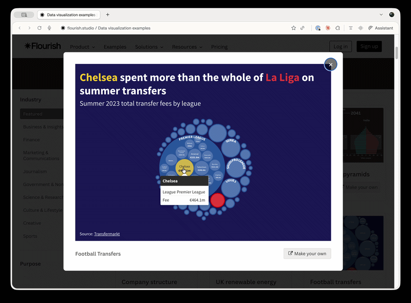
Compare that to the usual version of the same thing: you click a row in a table and it dumps you into another table. Technically the same information. Completely different experience. The interactive version lets you play with the data, find the story inside it, and follow your own curiosity. It turns reading numbers into something closer to a game, and that pulls real engagement out of work that is usually a slog.
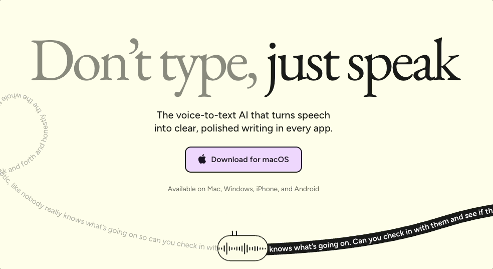
An animation that explains the whole product
This one comes from a designer named Hunter Thompson, a seriously talented Webflow UI designer. (He has no idea he is getting a shout-out.) It is the hero animation on a voice transcription product, and it is the best kind of demo: blur out every word on the page and you would still know exactly what the product does.
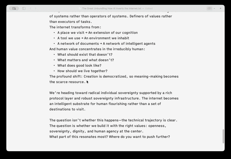
The animation takes words in, encodes them into audio, and writes them out onto a tape ticker, like the old stock tickers. It is a modern interpretation of a familiar image, and then the same motif comes back inside the product. Hit the voice transcription button and the ticker animation appears at the bottom of your screen. The micro-interaction tells the product’s whole story, twice, while giving it a personality nothing else in the category has.
[IMAGE: the same ticker motif inside the product, at the bottom of the screen] Capture: the transcription state appearing in-app when you hit the voice button. Caption: The same idea, carried from the landing page into the actual experience.
The whole page is worth studying, honestly. One big headline that says what it is, a single clear call to action, a black row at the bottom that hints there is more below and invites a scroll without nagging. Even the type makes an argument: “don’t type” sits in low-contrast gray, boring on purpose, while “just speak” is dark and clear. The contrast is doing the persuading.
iA Writer: an opinion about how you should write
A book is a wall of text. So is a draft. iA Writer, from Information Architects, has spent years winning awards mostly for what it refuses to add. The feature we keep coming back to is focus mode.
Turn it on and everything dims except the paragraph you are working on. You can dial it down further to focus a single sentence at a time. As your mode of writing changes, drafting freely versus going back to sharpen each line, the tool changes with you.
Here is what makes it more than a nice effect. Focus mode solves a real problem, cognitive load, by removing the rest of the document from competing for your attention. And it is an editorial stance. No dataset said “users want a focus mode.” Nobody requested it. iA had an opinion, that writing should happen at the paragraph level, and they built the opinion into the product. That opinionated nature is the personality. You can tell the people who made this actually write.
The same discipline shows up in how they use color. It is not decoration. Toggle a mode and it highlights every adverb in a sentence so you can see your own crutches. Color in service of the work, not whimsy.
This is the opposite of the feature factory, the lazy strategy of shipping whatever users ask for next until the product is bloated into uselessness. The irony is that focus mode is what you get when you actually listen to users. Not the analytics, the conversations. Nobody says “I need a focus mode.” They say “writing gives me anxiety and this wall of text is intimidating.” A thoughtful designer takes that and builds the thing that addresses the feeling. iA Writer is fifteen years old and still doing it. They are clearly doing something right.
The five jobs a micro-interaction actually does
Step back and the same tired objection falls apart. “Those are just delight features.” Across these examples, the small stuff is doing real work:
It communicates state. The system tells you where it is and what it is doing, like Claude’s thinking words instead of a dead spinner.
It builds partnership. The right interaction shifts the relationship from user-and-tool toward something more like a conversation.
It reduces intimidation. A confetti milestone or a clean install button makes a product feel handleable instead of overwhelming.
It guides attention. The flow tool’s speed, iA Writer’s focus mode, the gradient on a button, all of it points you at what matters next in a noisy world.
And all four of those roll up into the fifth: it improves the perception of quality. Which, often, is not a perception at all. It is quality, made visible.
Taste is knowing what not to add
If there is one line to take from all of this, it is this. Taste is not knowing what to add. It is knowing what to leave out.
Anyone can add confetti. It is one prompt away. The skill is knowing not to put it on the credit card screen, or the intake form, or every node in a diagram. Knowing where to spend your attention and, just as much, where not to. Restraint is the part you cannot fake, and it is the part the tools cannot do for you.
Think of it this way. Most products have features, and right now everyone is hammering out feature after feature. Few products have manners. Manners are the small signals that say here is how we behave, here is how this relationship works, here is what we will not do to you. Micro-interactions are how a product makes itself a little vulnerable and knowable, so it relates to you instead of just serving you.
That is the opportunity hiding in this moment. The point was never to build faster. Everyone is already racing there. The point is that because you can build faster, you should build with more care. AI did not lower the bar. It took away the excuse, and the bar went up. Giving your software manners, deciding how it behaves and where it shows restraint, is about to be one of the sharpest competitive advantages there is.
Build with care. Not just fast.
Acquired Taste is a video series where Jeremy Belcher and David Issa break down products, platforms, and product decisions through the lens of design and strategy. Design Language is the newsletter that goes with it, one concept for product builders every two weeks, at designlanguage.xyz.

About Us
Design Language is a newsletter for all product builders (PMs, Engineers, Founders, etc) who want to improve their design literacy, hone their sense of tase, and improve their craft when building products.
Jeremy Belcher is a 15 year product and design veteran. He has designed UX/UI for products used by tens of millions for brands like Google, Salesforce, Saturday Night Live, DirecTV, BMW, Emirates, Visa and in the past several years has focused on new enterprise workflow products. He runs the product studio Robot Heart, which designs, builds, and validates 0 → 1 B2B workflow tools for teams and founders.
David Issa is a digital strategy and product design leader with over 15 years of experience guiding companies through transformation. He has helped scale products and teams across healthcare, fintech, and enterprise software, translating complex systems into human-centered experiences. David runs a strategic design practice focused on aligning purpose, architecture, and execution—bridging design, AI, and organizational strategy to help teams build with clarity and intent.